The brief
Design agency Brain Sinew partnered with me to create a website that translates Advanced Scaffold’s new brand into the digital world.
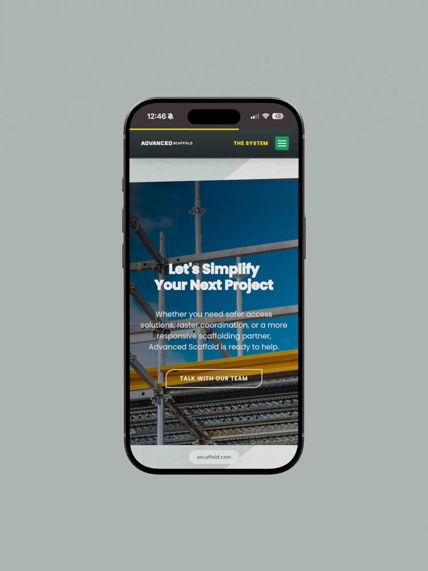
The client requested a single landing page where partner companies can learn about their business and develop a strong first impression.
Read the full storyShow less
The problem
Advanced Scaffold had no dedicated online page to direct partners to, which was limiting their reach. They were not particularly interested in a solution that prioritizes traffic volume, but instead wanted a page which gives visitors a clear understanding of what they do.
From a design standpoint, the main challenge was making their unique service offerings, which involved complex scaffolding mechanisms, intuitive for laymen to grasp on a digital screen.
The solution
Since everything had to be contained in one page, I built a custom WordPress page and paid particular attention to the typography, navigation and smaller interactions. In a Midwest market that values an established presence, the design needs to convey experience as well as reliability from the very first impression.
A contact form was also included after a carefully considered brand introduction, giving partners a clear way to reach out.
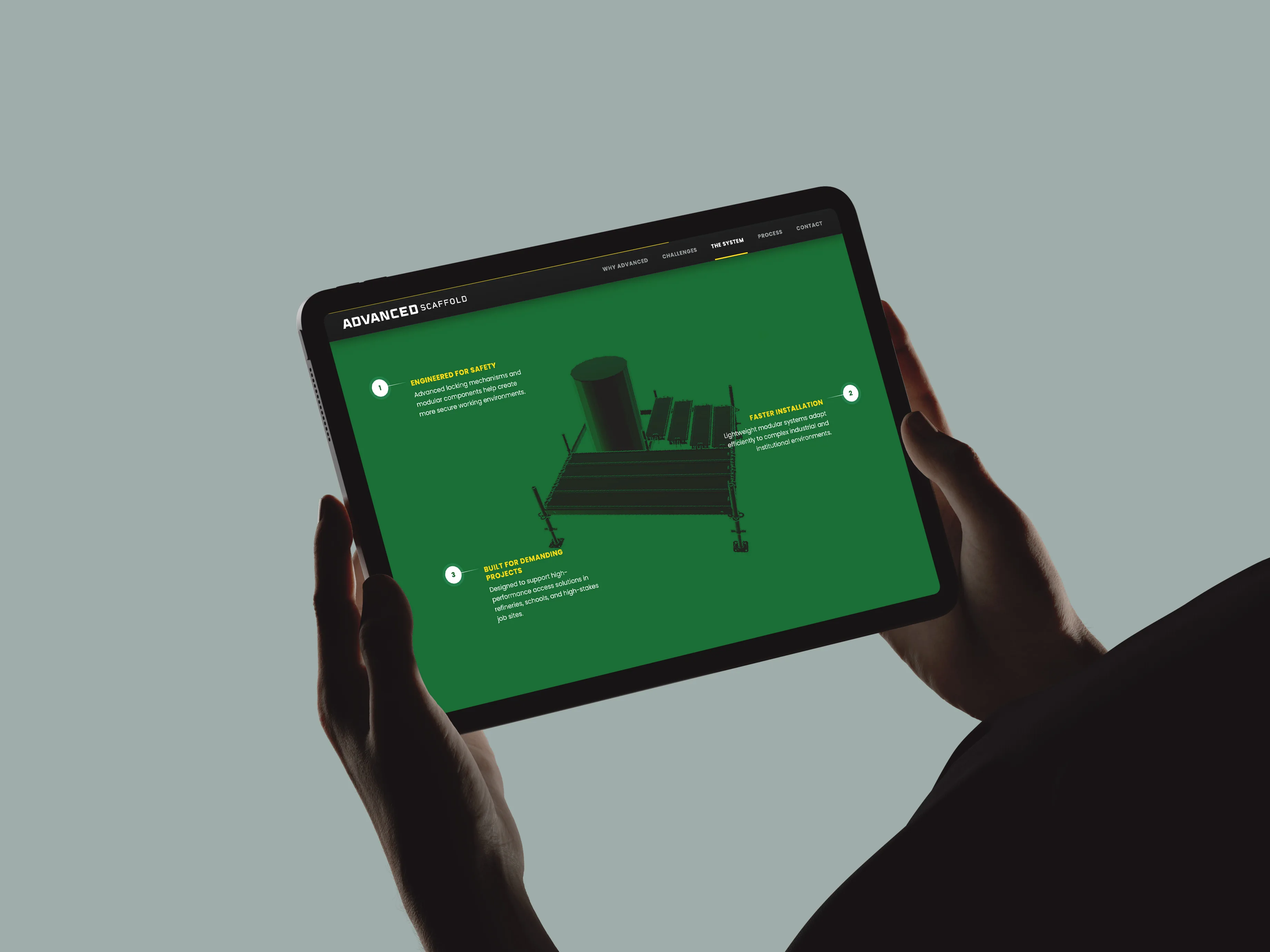
In terms of translating their intricate locking mechanism to a digital environment, I created a 3D assembly sequence that shows the physical system as visitors scroll.
The Stack
WordPress underneath
WordPress gives the team a familiar CMS and is an ideal platform to start on. It has no license fee and offers an exhaustive library of plugins for a growing business.
Built for performance
A fully custom theme keeps the site focused on the code it actually needs. Styles and scripts are written for their exact build and unnecessary weight is kept out of pages.
Built to grow
The code is owned and organized to scale. Palette, type and motion live in one tidy brand layer, with the architecture staged for block-based building as the site grows.
Fully tailored
From the smallest interface element to the custom 3D presentation, everything is tailored to Advanced Scaffold’s identity. Buttons, transitions and motion share the same visual language, so the brand comes through clearly.
Show, don't tell
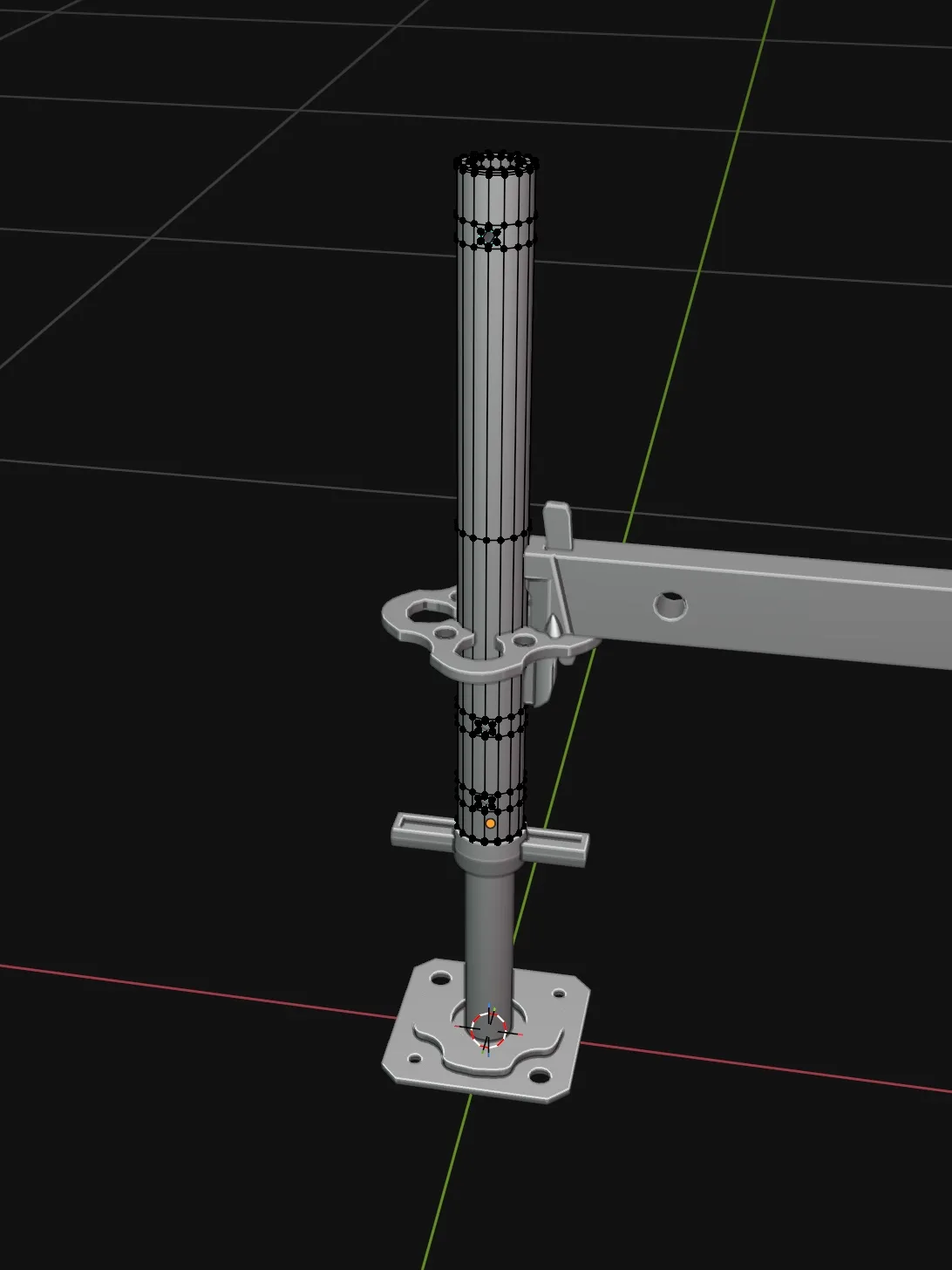
The 3D demo became the heart of the one-pager as it was the clearest way to establish brand authority. The frame assembles piece by piece as you scroll and in the order an Advanced crew would assemble it. This was a complex task and it involved sourcing the actual PERI UP component models, matching the gravity lock’s action to the real mechanism and translating this into a 3D animation.
The accuracy was vital, as people evaluating the page may work with this exact system daily. The animation gives them something concrete to inspect, while the copy underneath supports what they see.
The Parts
A one-pager done right.
My work in Italy often gives me room to be more experimental, but for Advanced Scaffold’s Midwest audience, I wanted the page to feel established and dependable. I kept the larger structure straightforward and put the expression into the details. The navigation is responsive as you scroll, the brand pattern reacts to your cursor, and headlines fill in as they enter your view.
These gave the identity movement while keeping the company and its work in focus. Moving a Midwestern brand into the contemporary world meant that the page had to feel current while communicating the sense of stability and reliability its audience expects.
Built so version two isn't a rebuild.
The launch was one page, but the final build leaves room for what may come next. The brand lives in code as tokens, which keeps the visual system consistent via block-based building. Heavier scripts only load where they are needed.
Post-launch, the client expressed that the site looked fantastic. I am pleased that the first impression I built will sit on a foundation they can continue to build on, with the identity carrying through as the site expands.