
Convention maps are notoriously difficult to design. They need to enable large crowds to navigate unfamiliar, complex venues at a glance. Balancing that clarity with visual appeal is where the challenge begins, and an indoor comic con map or trade show map can easily become flat, crowded and a little boring. By contrast, an amusement park map can feel wildly illustrative and informational at the same time. The difference is usually not a lack of imagination, but a matter of density; a convention map needs to display tens or hundreds of booths alongside rooms, staircases, entrances and routes. By the time we communicate all of this information visually, the designer is fighting for every pixel.
Nevertheless, I believe that convention maps can be both beautiful and functional, and it is our job as designers to strive towards achieving this duality. Since 2024, I have redesigned the venue maps for some of the largest comic conventions in the US across the ReedPop portfolio, transforming each from a flat 2D floorplan to a bespoke 3D map. From the Javits Center in New York City to the Seattle Convention Center, every venue has presented a different set of challenges. That is why each 3D venue map must negotiate the tension between a consistent design language and the unique demands of its architecture, bringing them together in a solution that feels native to each building.
Why the Flat Convention Map Falls Short#
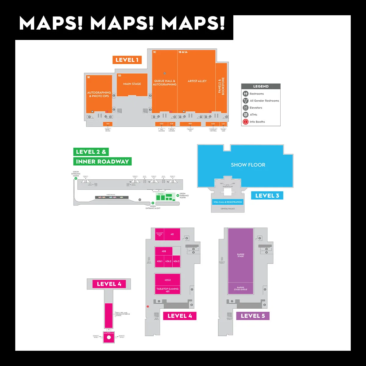
Using a flat 2D design does not automatically create a bad map. For a simple venue with only one or two floors, it may in fact be the best option. This was the case with my experience creating a map for Florida Supercon, a two-floor show where a 3D approach wouldn’t meaningfully improve the experience. However, the problem begins when the building complexity starts to clash with the simplicity of flat designs. When a venue stretches across five or more floors, over skybridges and into a second building, visitors are no longer simply asking “Where is this room?” They are trying to understand how the entire place fits together and building a mental model to orient themselves. At this point, a conventional 2D map is no longer the logical choice as it doesn’t effectively meet the needs of its readers. This is particularly true for large events where the scale raises the stakes; NYCC serves around 200,000 fans across four days in a multi-level building with a concourse and underpass. ECCC serves around 100,000 fans across ten floors spanning two buildings. At that point, the map has to explain relationships and is where a 3D convention map earns its place. The goal is not to add perspective for the sake of adding perspective, but for orientation.
The New Standard: One Custom 3D Map per Building#
Across my map projects, one central idea has remained true: convention map design has to start with the actual venue. Although the maps for NYCC and ECCC have a shared 3D visual language, they are not variations of the same template. Each 3D venue map was built considering the spatial logic of its venue, and while the method is repeatable, the solution has to be customized.
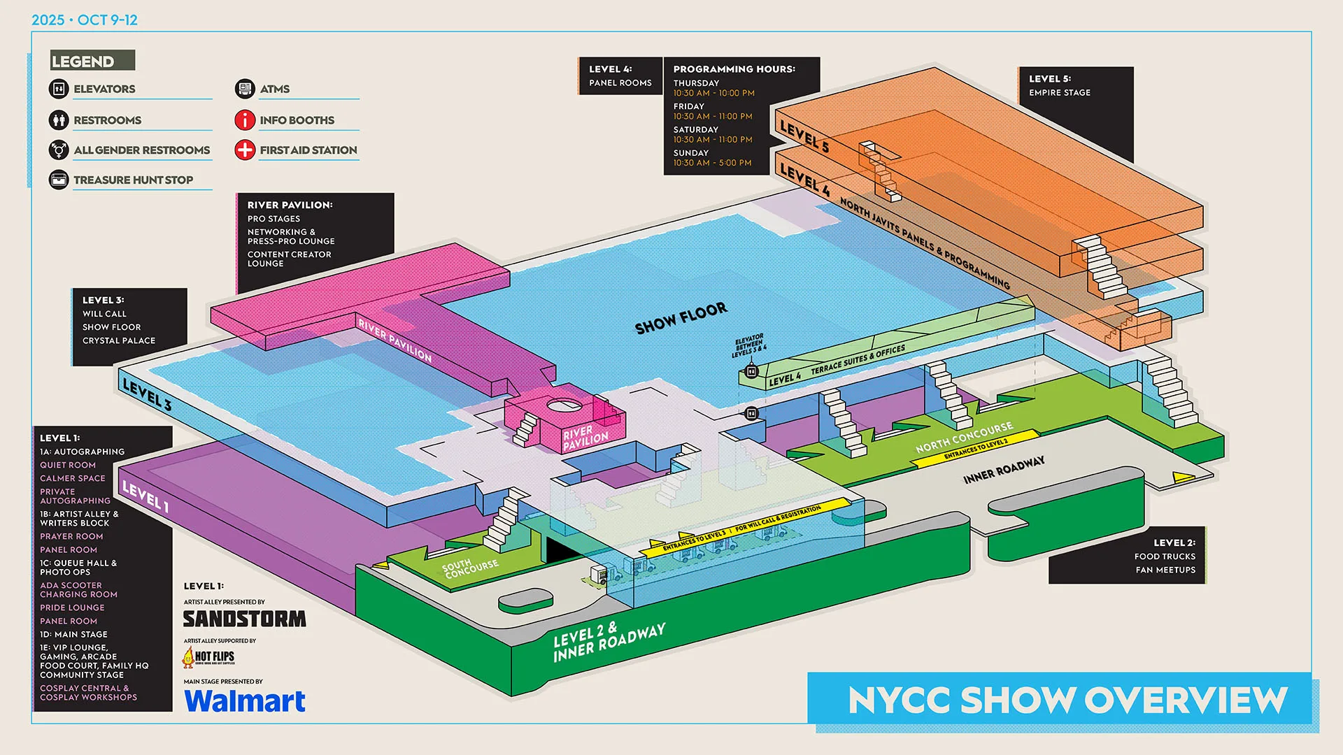
When designing the ECCC map, I needed to clearly explain the relationship between buildings as well as the skybridge and streets connecting them. I built the full map in 3D, which was helpful for understanding such a complex venue, but was also time-intensive. In retrospect, much of the final artwork could have been drawn more efficiently. I took this lesson forward when creating the NYCC map, where I needed to stack the floors and design vertically-first to ensure the Javits Center was understood as one interconnected venue. Instead of building it fully in 3D, I moved the workflow into Illustrator and used vector drawing and shading to create the appearance of 3D without constructing a complete model. I’ve since used this faster, more flexible approach for other event maps including MagicCon.
Whether the map is built in 3D or in Illustrator, one custom 3D map per building should be the standard workflow. If every building asks a different question, every map needs its own answer.
Finding the Angle for a 3D Convention Map in Illustrator#
If you’re wondering how to design a map in Illustrator, I would recommend steering clear of the details to start with, and focusing instead on your viewing angle. The angle is a great starting point as it decides which floors will be visible, what components overlap and how entrances read. It defines the perspective through which fans view the map, and determines if they can understand the connection between levels.
In selecting the best angle for your 3D map, you should consider where the most important information is located. For instance, which side of the venue holds the recognizable landmarks? If you can visualize the answer intuitively, then you have a direction. If you can’t, you can also brute force it using Illustrator like this:
- Create a rough venue outline. Start with the simplest reliable footprint you can get, perhaps from an existing 2D map or floor plan.
- Group one floor. Take all known booths, entrances, labels and assets for one floor and group them together.
- 3D Extrude. Use Illustrator’s 3D tools to turn that grouped floor into an extruded object.
- Add only enough detail to expose problems. Rooms, booths and stairs can be extruded separately or even sketched in with the pencil tool, as the point is to identify any blockers before committing to final artwork.
- Repeat steps 1-4 for multiple floors and stack them.
- Experiment with viewing angles. Rotate your levels around and find the angle which reveals all the important information.
At this stage, the best angle is always the one that preserves the right information. Issues such as rooms blocking a hallway should be tackled with a different angle at this stage, saving you unnecessary work when drawing the entire map later on.
The ECCC Map: Solving the Two Building Problem#
When I created the ECCC map, I had never been on-site. This was challenging as it required me to build the map using various fragments of information. Every piece had a place, but understanding how they formed a complete building was difficult.
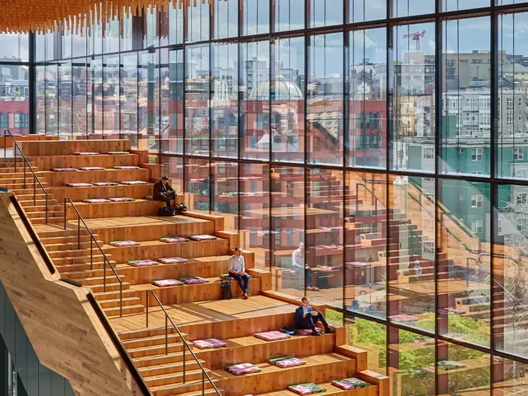
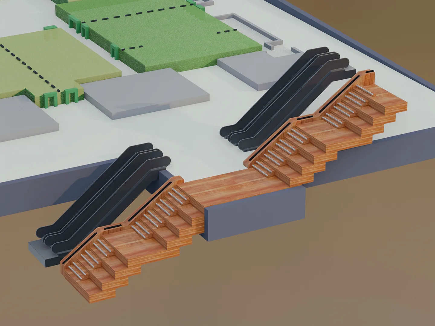
My approach to this started with studying the official venue floor plans and building a large catalog of images to help me understand how the staircases joined floors and how elevations varied. I also explored the 3D walkthrough on the convention center’s website, which was the single best resource I had available. The scale of the task quickly became clear: ten floors split between Arch and Summit, two buildings separated by several streets. Arch added another layer of complexity as its two sections only connect via a skybridge on the fourth floor. It became clear to me that the event route a fan might choose to follow depended on their understanding of that connection, so a functional 3D floor plan had to clearly show the location of the skybridge and how it connects the Arch building.
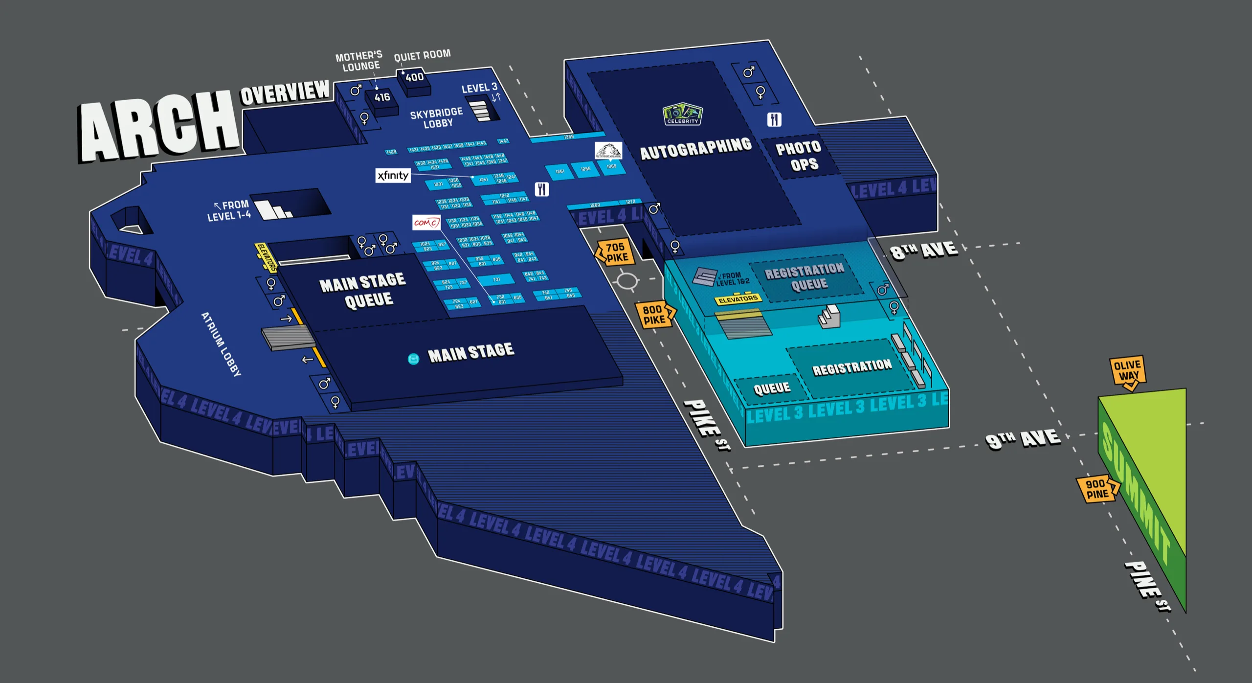
Despite several informative sources, I still had to fill certain gaps with YouTube walkthroughs and renders from the architects’ website. With each new source I gained a new piece of the puzzle and was able to build my final workflow for the project. I settled upon a combined approach using Blender and Illustrator for the final product. Six Summit levels were stacked into one cascading view, allowing fans to see the vertical relationship without opening six disconnected plans. I also kept the 3D structural render separate from the vector wayfinding layer, ensuring that changing labels wouldn’t require me to rebuild the venue map.
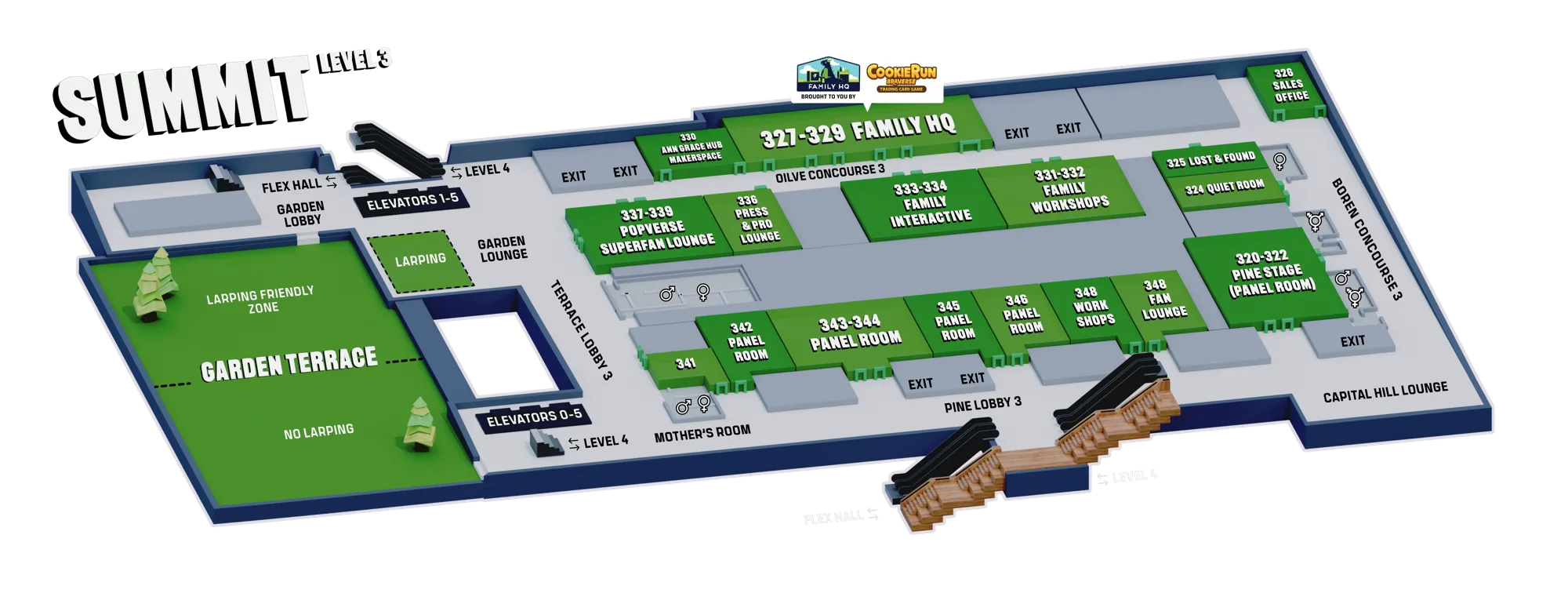
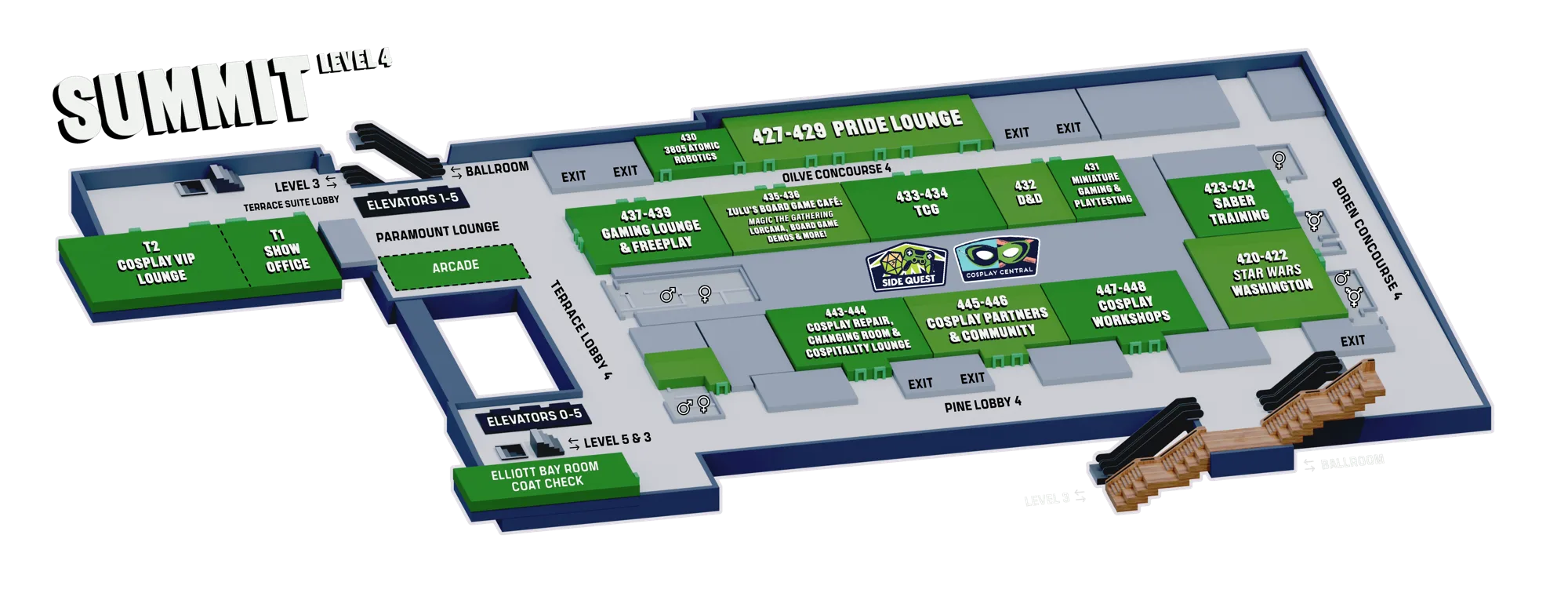
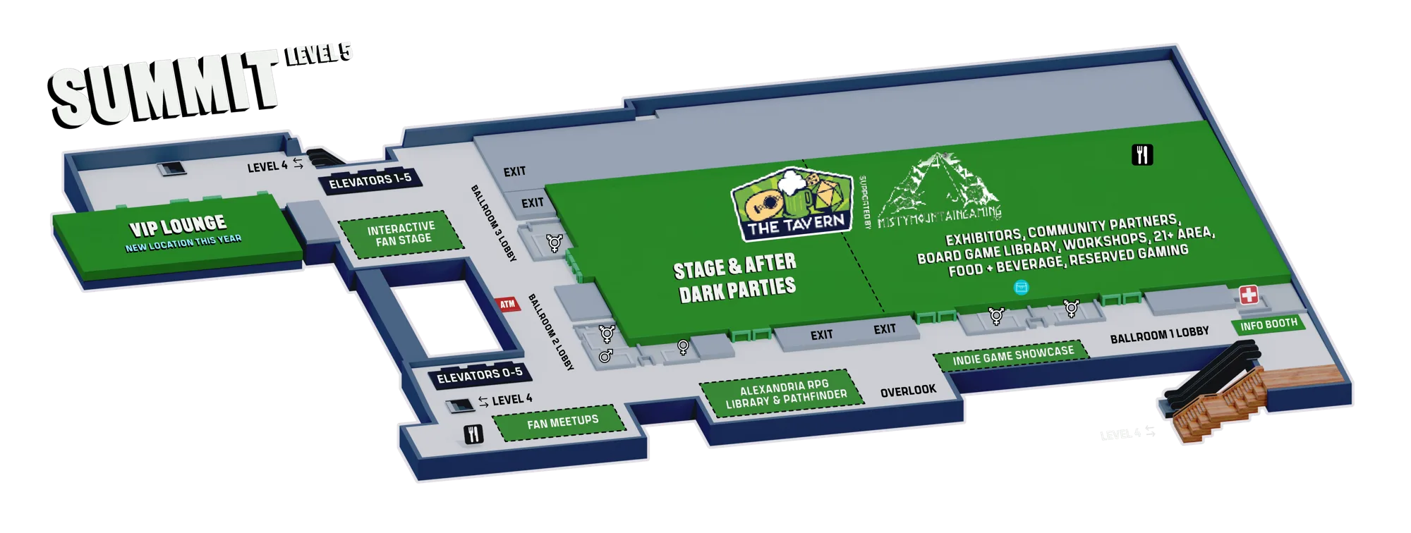
In the end, the real test of the map’s functionality was whether it solved the problems fans were previously experiencing. In 2024, event satisfaction had declined by 7% and navigation between venues was identified as a top detractor. After the map redesign described above, reported issues fell by 11% overall, with reports related to navigating the skybridge falling by 92%. Fan satisfaction was also no longer in decline and showed positive growth. The venue had not become any simpler, but the map had made its two complex buildings finally make sense as one event.
The NYCC Map: Stacking the Javits Like Lego#
The NYCC map is undoubtedly my favorite work in the series. I designed it after ECCC, and this time I had the opportunity to explore the Javits Center on-site. I spent the entire flight home thinking about how its levels could fit together, and by the time I landed, the idea had clicked. I drew my visualisation out on paper as soon as I got home, knowing I had found the correct direction: the Javits Center map needed to read as one connected structure rather than a collection of isolated floor plans.
The real challenge was not any single floor, but understanding how all five levels worked together. With no cross access on the upper floors, the level 2 concourse functioned as the spine of the Javits Center. It ran beneath level 3, connected North to South and provided multiple access points to level 1. Yet the existing flat 2D maps had placed the concourse on its own isolated plan, despite it being the level that tied the venue together.
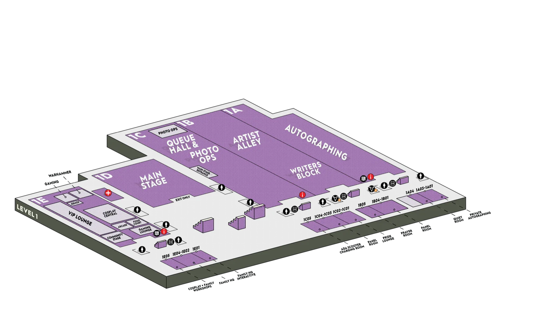
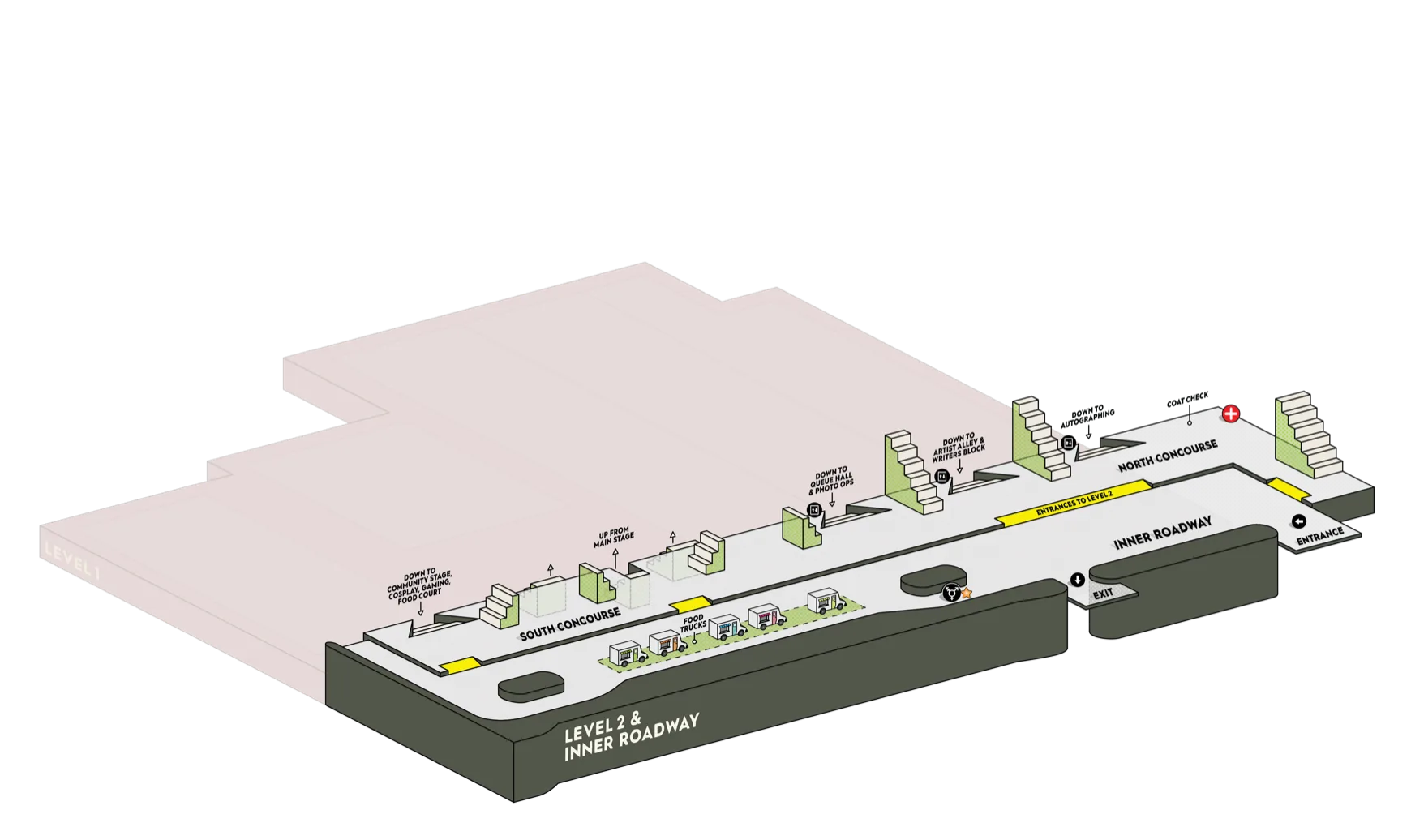
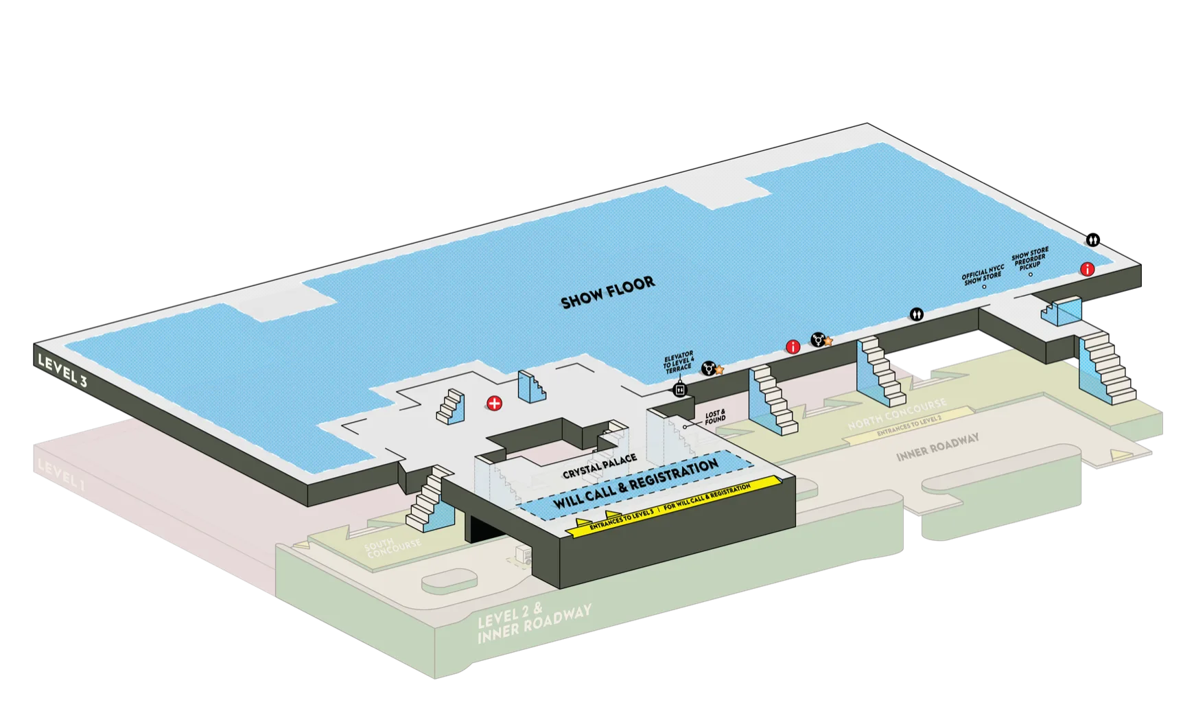
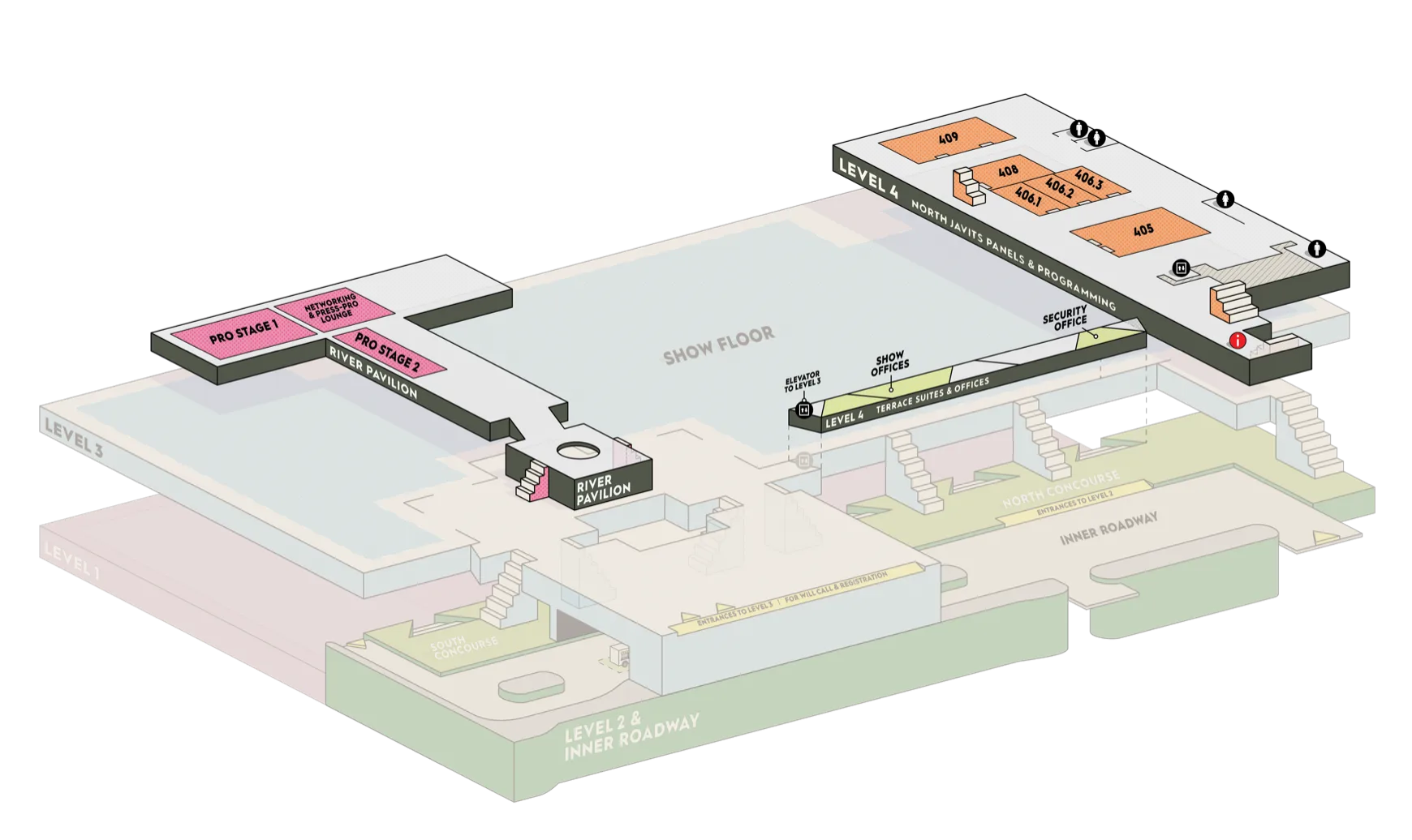
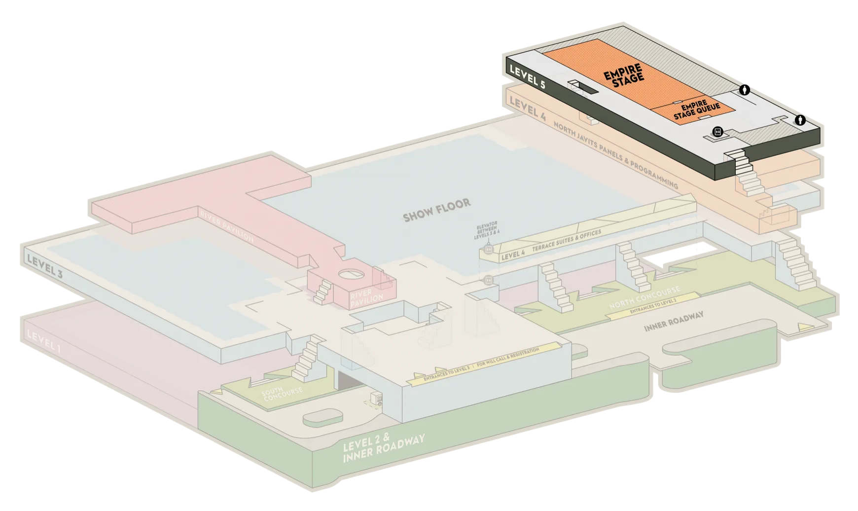
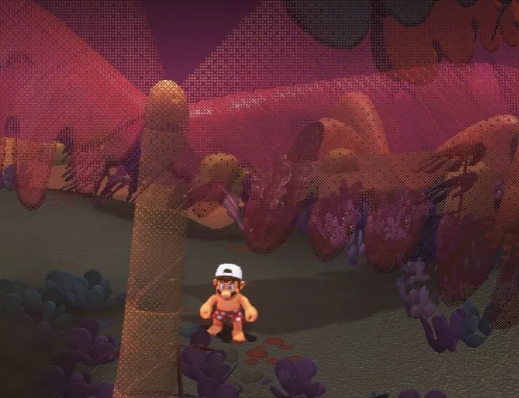
To address these problems, I wanted the floors to act like interconnected pieces of Lego, with staircases clearly displaying how each level relates to another. This would enable me to present the Javits Center as one complete structure, while also distinguishing between North and South buildings. However, building this in 3D also meant that rooms could visually block hallways, staircases could cover important labels, and choosing the wrong angle could clarify one connection at the expense of another. Since I was set on using the stacked approach for these 3D maps, I drew inspiration from my love of video games and interest in shader code, turning to Super Mario for a wayfinding solution. Using a technique called dithering, I gave the staircases a glass-like treatment which allowed them to remain visible without obscuring any information behind them.
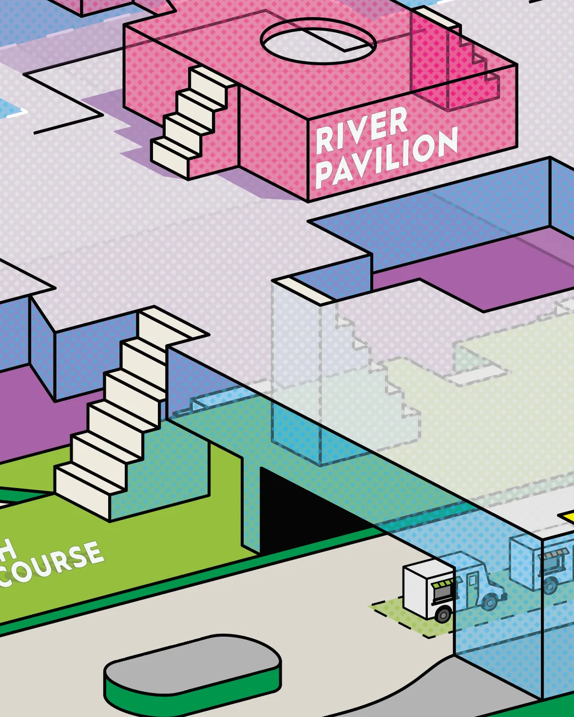
The final NYCC map was designed vertically first so it could work effectively across different apps and signage. The floors read as one connected venue, with connection points remaining distinct enough to follow, creating a functional event map for over 200,000 visitors. The success of the map is described simply in the words of an NYCC marketing manager: “This is the clearest I’ve ever seen the Javits!”
The Design Decisions Behind the Pixels#
Every decision in good comic con map design needs a reason. More information does not automatically make a map more useful, just as clarity often depends on what is left out.
At ReedPop, this principle guides every decision we make. For instance, we do not add booth names directly to the final artwork. This is because exhibitor information can change, and we don’t want wrong information to misguide fans. Nevertheless, this information is important and should be reflected somewhere. A separate legend is a suitable place for this changing information, but it should be designed with as much care as the map itself, rather than as an afterthought.
The same principle applies to color, where we consider what every color communicates and whether it improves or impedes map accessibility. Color should be used with intent, not just to decorate the map, but to clarify the experience. Where our choices have sometimes fallen short, fans have created their own maps, including versions of the ECCC maps with color palettes that improve ADA accessibility. The adaptations serve as valuable feedback and remind us that color is another functional design decision that should be made with intent.
What Fans Want Next, and the Tooling to Get There#
I am always exploring where my maps should go next. I feel comfortable that my current approach can resolve most navigational problems and create a great product, but I believe convention maps can evolve further. They can become more personal, interactive and fun to use before and during a show.
Imagine an event map where fans can add notes, doodle and mark where they want to go. In this way, they can turn an otherwise static reference into something personal and unique. I’ve already begun exploring this idea through an interactive, schedule-based simulation that combines event data with 2D floor plans to generate a live 3D view. The 3D simulation shows the live movement of people from one panel to another alongside other features such as panel models, guest speakers, audiences and real time notifications for fans viewing the map through digital signage. Eventually, it could become a comprehensive indoor map solution for NYCC, ECCC and other events alike.
Where This Is Heading#
Convention maps are strange things to design. They sit at the intersection of architecture, illustration, wayfinding design and event mapping. They have to explain a real building, be functional and also additive to the overall event experience.
Not every problem has been solved yet and maps will continue to evolve, which is what makes the next step interesting. Regardless of the direction that map design takes in the coming years, the goal for designers should stay the same: make a map that improves the fan experience.