
Key Takeaways
- The central goal of map legends is to enhance the user experience and reduce guesswork
- The legend should help shape the map from the beginning, rather than be added as an afterthought
- The map key gives designers more creative freedom to create abstract, playful maps
A map legend, often called a map key, is a visual guide that explains the meaning of the symbols, colors, and lines used on a map. It plays an important role in translating a map’s visual language into geographic or spatial information which we can understand. Without a key, you might be looking right at the information you need and still not know how to read it. Whether we are looking at a topographic map or a trade show floor plan, that understanding is the foundation for finding our way.
That gives designers more freedom in how we draw a place or world. A color gradient can show how crowded an area is, while an abstract shape can represent a building. The map key makes those choices understandable, and allows us to move beyond the literal depiction of a place. A map can look radically abstract and still communicate clearly as long as its key gives us the means to read it. I strongly believe that the drawing and its key need to be designed together, so that someone can move easily between what they see and what it means. This concept goes back thousands of years to the world’s oldest recorded map.
A 3,000-Year-Old Design Standard: The World’s Oldest Map Key#
The history of map legend design reaches back more than 2,500 years, to a small clay tablet in the British Museum. The Babylonian Map of the World from ancient Mesopotamia is dated to around the sixth century BCE, and already brings a spatial drawing together with text that explains it. This is an extraordinary glimpse of the relationship between a map and its key, preserved in clay across millennia.
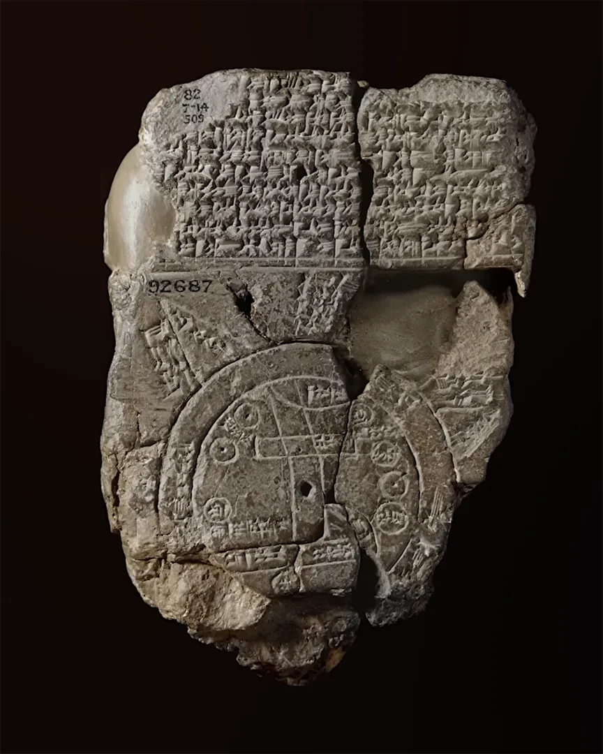
On the front, two circular lines mark the “Bitter River” - a ring of water surrounding the known world. Inside are places the Babylonians knew, including Babylon and the Euphrates. Beyond the water, triangles point outward into distant regions, which we can see lie beyond the known world. However, the triangles alone don’t tell us what the Babylonians believed was there.
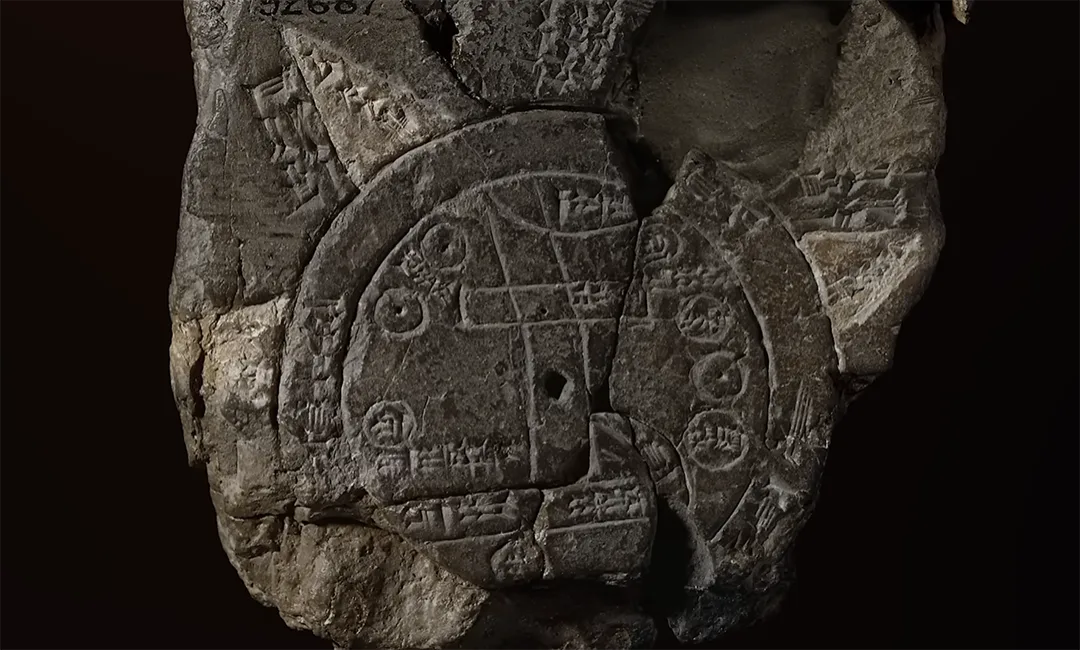
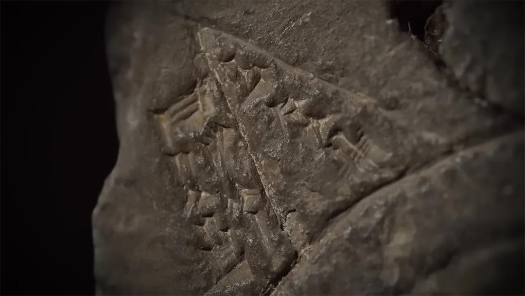
Instead, the cuneiform writing on the reverse helps us make that connection. The distant regions belong to a world of inherited stories: a place without sunlight, a tree bearing jewels and mysterious lands beyond familiar territory. The tablet also carries stories of mythical creatures and legendary figures in the text above the map, so its visual language makes sense within the beliefs and knowledge of the people who used it. The text also describes travel distances and what a traveler might encounter. Read alongside the drawing, these details aid us in understanding what the Babylonians believed lay within those distant regions.1
That’s what draws me to this ancient map key. Even with thousands of years between us, we can see the same need to connect a shape with its meaning; the explanation gives us access to a world we could never reconstruct from the drawing alone. That relationship also gives designers more creative freedom, because we don’t have to draw everything too literally. Instead, we can focus on the visual language that communicates the information best, knowing the map legend will help readers make sense of our choices.
What Does a Legend on a Map Show?#
A map legend explains the visual information a reader needs to interpret. Most of that information falls into three groups:
- Point symbols which identify particular locations or facilities. These might mark a landmark, an exhibitor booth, an elevator or a bathroom.
- Line symbols which represent connections and boundaries such as roads, walking routes or the edge of a restricted area. Different widths, colors and dash patterns can distinguish one type of line from others.
- Area symbols that use fills, shading or patterns to describe a larger space. They are used to portray areas such as a building, an exhibition zone or an area closed to visitors.
A key can also explain values. For instance, on a map showing crowd density, color could distinguish quieter areas from busier ones. Similarly, larger text can suggest a more important destination, but if font size represents a specific classification, then that distinction needs to be clear as well.
Deciding what belongs in the legend is also part of the design. A reference map may need a comprehensive key, while a thematic map can leave familiar background features unexplained.
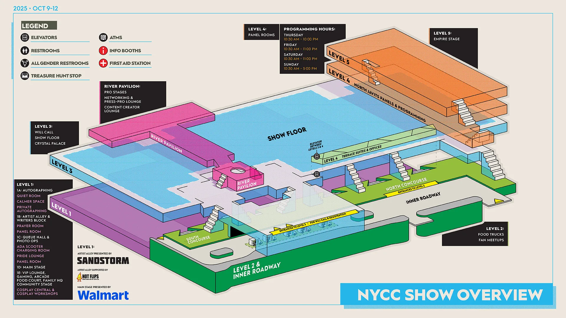
Applying these principles to my own work creating large Comic Con maps, I’m able to leave more attention for the information visitors actually need to interpret: the event’s categories, facilities and symbols. Among all this, the guiding principle we should adhere to is whether an entry helps someone understand something they would otherwise have to guess.
Why Map Legends Matter for Design and Usability#
In my view, the main purpose of map design is communication. We might spend hours refining the architecture, but the colors and labels need attention too. Ultimately, the result still has to help someone understand where they are and what they can do next.
When making the Comic Con maps, the first challenge I encountered was giving people a clear read of the venue. They needed to understand the distinct levels, how floors connect and where entrances were located. I always try to keep as much of that spatial explanation in the drawing as possible by using the correct visual cues in the design. For example, fan facing rooms are green and taller than the areas outside the event which are grayed out or omitted. This is important, because the legend can then concentrate on what individual symbols mean, instead of trying to explain the entire building again.
This is where I think the map’s user experience usually has the most room for improvement. Each time we decide whether something belongs in the drawing or the key, we are deciding how much work the visitor has to do. Those choices need just as much thought as the drawing itself.
5 Best Practices for Map Legend Design#
Great map legend design comes down to making the connection between a symbol and its meaning easy to follow. These five practices give us a useful starting point:
- Use Consistent Symbols. Use the same icons in both the key and map, preserving their shape, color and size wherever possible. A visitor should be able to recognize the match immediately. For line and area samples, you should aim to show enough of the pattern to make it recognizable and preserve any size differences which carry data.2
- Logical Grouping. Organize entries according to the way people look for information. Group related entries under headings such as “Area Indicators” and “Line Classifications” keeping descriptions close to their symbology. This helps visitors find what they need without scanning the entire key.3
- Be Creative With Your Title. Try to avoid generic titles like “Legend” for your key. Instead, use descriptive titles like “Event Amenities” or “Trade Show Key” to give readers a clearer idea of what the key covers.4
- Embrace Simplicity. Include only the explanations your audience really needs. A familiar blue “P” for parking may not need a separate entry, but we should also be careful about assuming that familiarity, particularly at events with visitors from different backgrounds.
- Placement & White Space. Give the legend a deliberate place in the map layout. A corner or an open margin works well, assuming that you leave enough space between groups to make them distinct. The legend should be easy to find and comfortable to read alongside the map it explains.
Designing Keys for 2D vs. 3D Maps#
The perspective in which we draw a place changes how much its key needs to explain. In a 2D floor plan, a staircase might become a small icon and an important landmark might become a colored shape. Those choices keep the drawing compact, but they can also ask the reader to learn a visual code before they understand the space.
On the other hand, 3D maps offer a different way to communicate some of that information. A staircase can look like a staircase and visibly connect two levels. A distinctive feature of a building can be recognizable through its form, helping people relate the drawing to the place they are standing in.
For my Emerald City Comic Con map in Seattle, I used the Pine Staircase and the sculpture outside the entrance as landmarks. The staircase’s stepped wooden form gave people something recognizable across floors, while the sculpture helped identify the arrival point. My choice to include those features was deliberately aimed at making the map connect with the buildings people saw around them. This also enabled me to give the map key a more focused job of explaining amenity icons and other symbolic information while the architecture helped people orient themselves.

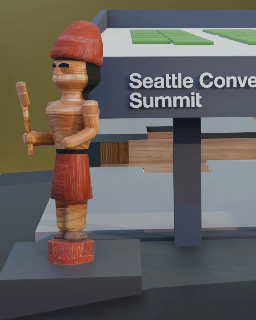
For me, designing a map key starts with understanding what a drawing already makes clear. A recognizable staircase may need no separate entry, while an unfamiliar amenity icon still needs an explanation. Whether the map is 2D or 3D, those specific needs should determine what goes into the key and how detailed it needs to be.
Digital vs. Print: How to Design a Map Layout#
The final format also changes how the map and its legend work together. A brochure, a large sign and a phone screen can carry the same information, but people read them at different sizes and in different circumstances. As designers, we need to account for those differences from the beginning.
For print, the legend needs a permanent, visible position within the composition. The right placement depends on the design, as long as the key stays close enough to the map to consult easily. On signage, the symbols and descriptions need to be readable from the intended viewing distance. In a brochure, they need to survive the smaller page and any folds. Checking the artwork at its actual output size matters much more than how comfortable it looks while zoomed in on a monitor.
Digital maps offer more flexibility, although a static map image on a phone still needs a readable key of its own. For an interactive map, a collapsible side panel or pop-up can give the legend space when someone needs it and return that space to the map afterward. The legend can also update as the reader zooms in or out, showing only the symbols visible in the current view. Importantly, the control for the dynamic legend needs to be easy to find, as hiding the explanation too well creates another problem for the visitor.
Across these formats, I would judge the selected layout by how easily someone can move between the information and its explanation. If a visitor has to keep scrolling, zooming or searching just to match an icon with a description, the legend is asking too much of them.
Sources#
- “The Map of the World,” collection record, museum no. 92687, registration 1882,0714.509, British Museum, accessed September 16, 2026; Irving Finkel, “The Babylonian Map of the World with Irving Finkel,” Curator’s Corner, season 9, episode 5, posted August 1, 2024, by the British Museum, YouTube video, 17:59.1
- Aileen Buckley, “Cartographic Design: Legends,” ArcGIS Blog, Esri, March 6, 2008.2
- “Map Legends,” Guide to Cartography, Ordnance Survey, accessed September 16, 2026.3
- Aileen Buckley, “Tips for Legend Design,” ArcGIS Blog, Esri, September 23, 2008.4
- Izabela Gołębiowska, “The Role of Map Legends in the Process of Map Use. Conclusions from an Exploratory Study,” Miscellanea Geographica 14, no. 1 (2010): 341–48.