The brief
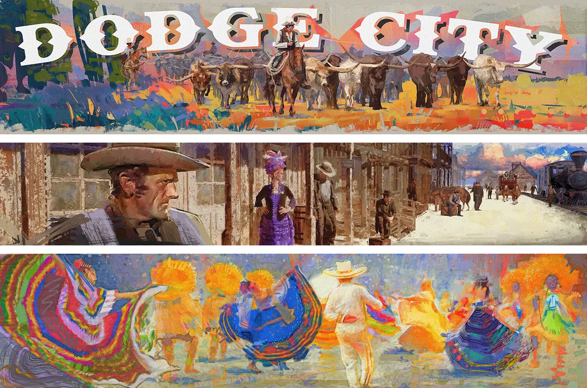
While working at Gardner Design, I was asked to lead a commission for the City of Dodge City involving three murals for the historic downtown.
The purpose was a celebration of its Western heritage and the community that’s shaping it today. This was meaningful on a personal level as it was my first major project at the studio - one which I personally owned from initial research through to the finished artwork.
Read the full storyShow less
The direction
I traveled to Dodge City to meet the municipal team and explore the history of the town through books and archival photographs. Building an understanding of the historic significance helped me make better decisions about everything, from the buildings in the murals to the people who would inhabit them.
My strategy started taking shape throughout this process; the murals would recognize the history that made Dodge City famous while also celebrating its present-day community. I also wanted to establish a bespoke illustration style that the city could later build on as part of a wider visual identity.
The Panels
Queen of the Cowtowns
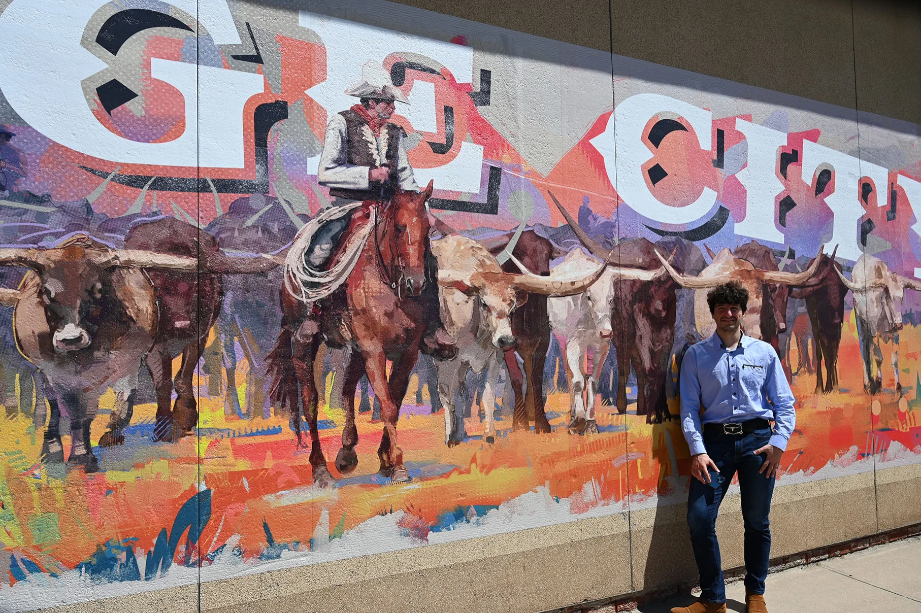
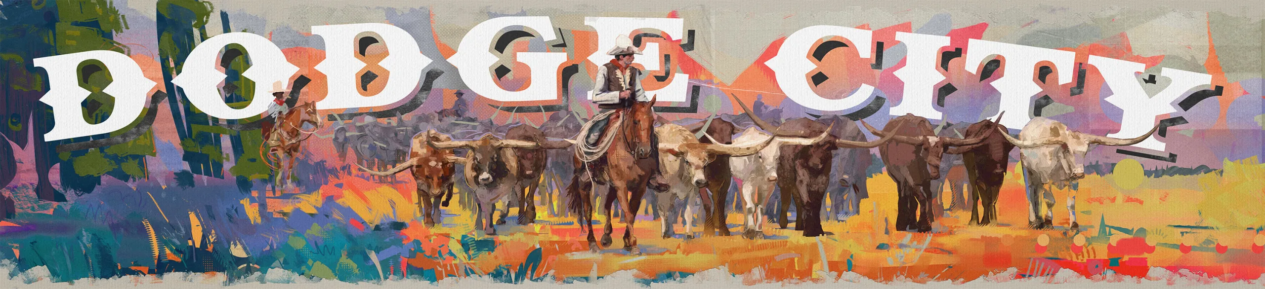
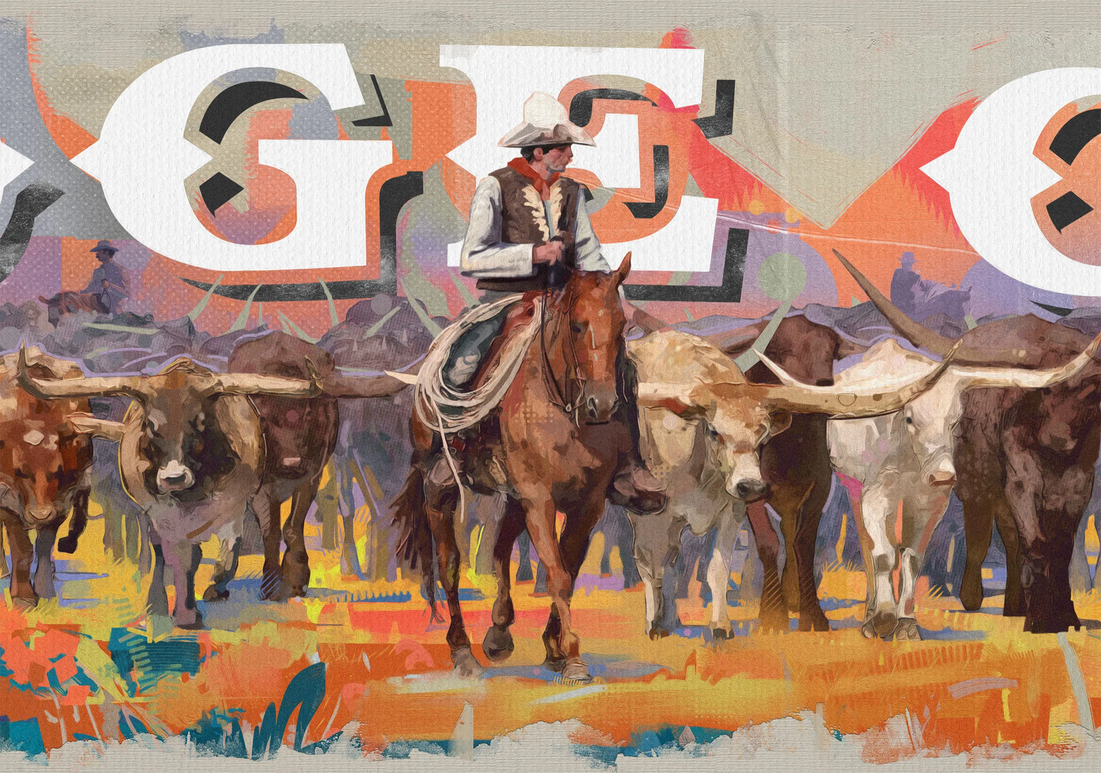
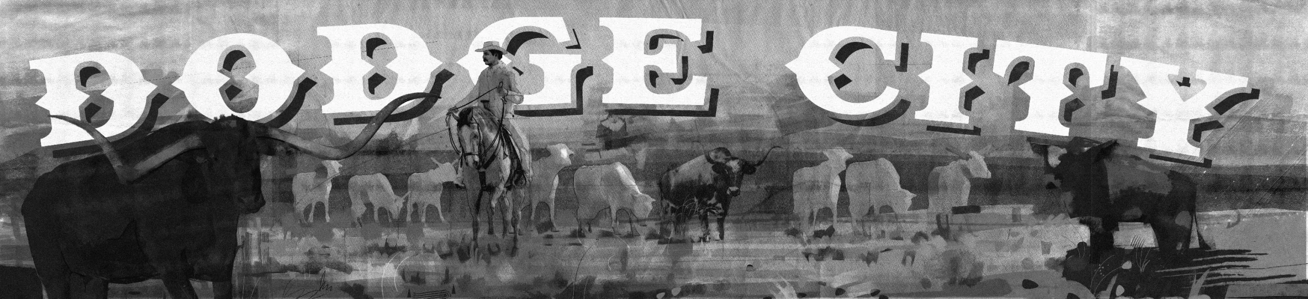
This panel celebrates the cattle trade behind Dodge City’s reputation as the Queen of the Cowtowns. I wanted to bring the longhorns towards the viewer, with a drover at the center to anchor the scene. The “Dodge City” name sits at the top in slab letters cut with a modern edge, with sharper cuts and the same broken color as the cattle underneath it, blending it in more naturally.

Homage to Dodge
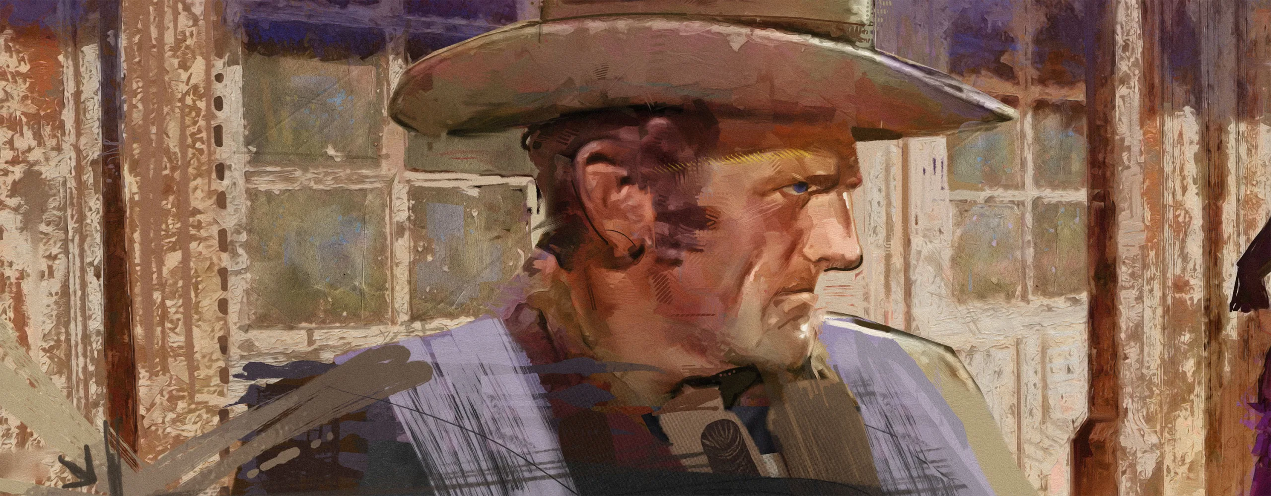
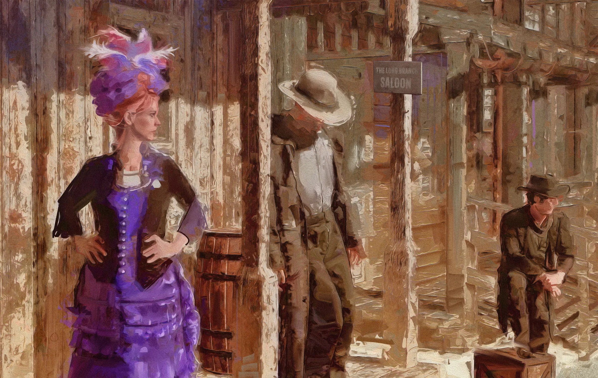
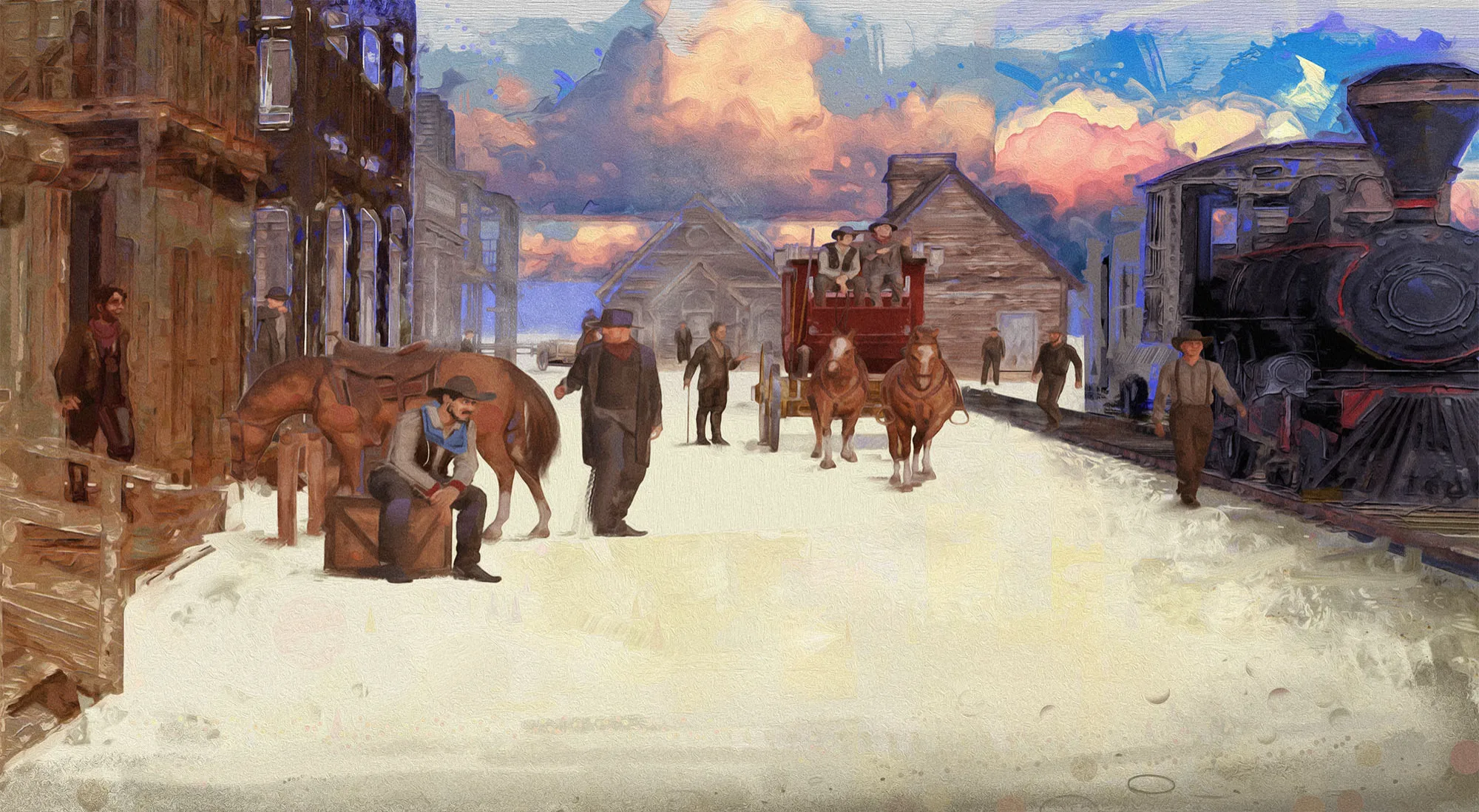
The second panel shows the town itself, with the foreground lawman paying homage to Gunsmoke. Behind him, Front Street stretches towards the railway; I used historical photographs to ground the buildings in the town’s 1880s landscape. Combined with the close foreground framing of a Western movie, the final mural is compelling and historically relevant.
Fiesta in Motion
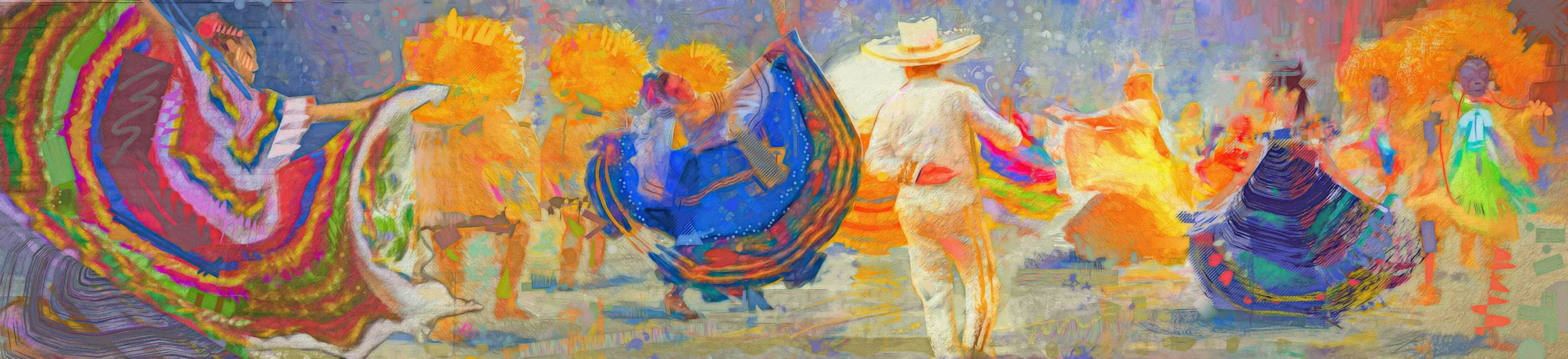
The third panel is in the present tense, celebrating Dodge City’s growing Hispanic community. It is the loudest mural of the three by a wide margin.
I used the sweep of folklórico skirts to portray movement across the mural, with a brighter palette and looser brushwork than the historical scenes. Since this one would be located where the city holds international events, the mural was designed to give that celebration a permanent presence in the space. Without it, the set would simply be a museum piece about a historical town, but this grounds its place in the modern world.
Close Up
Process
Finding the Composition
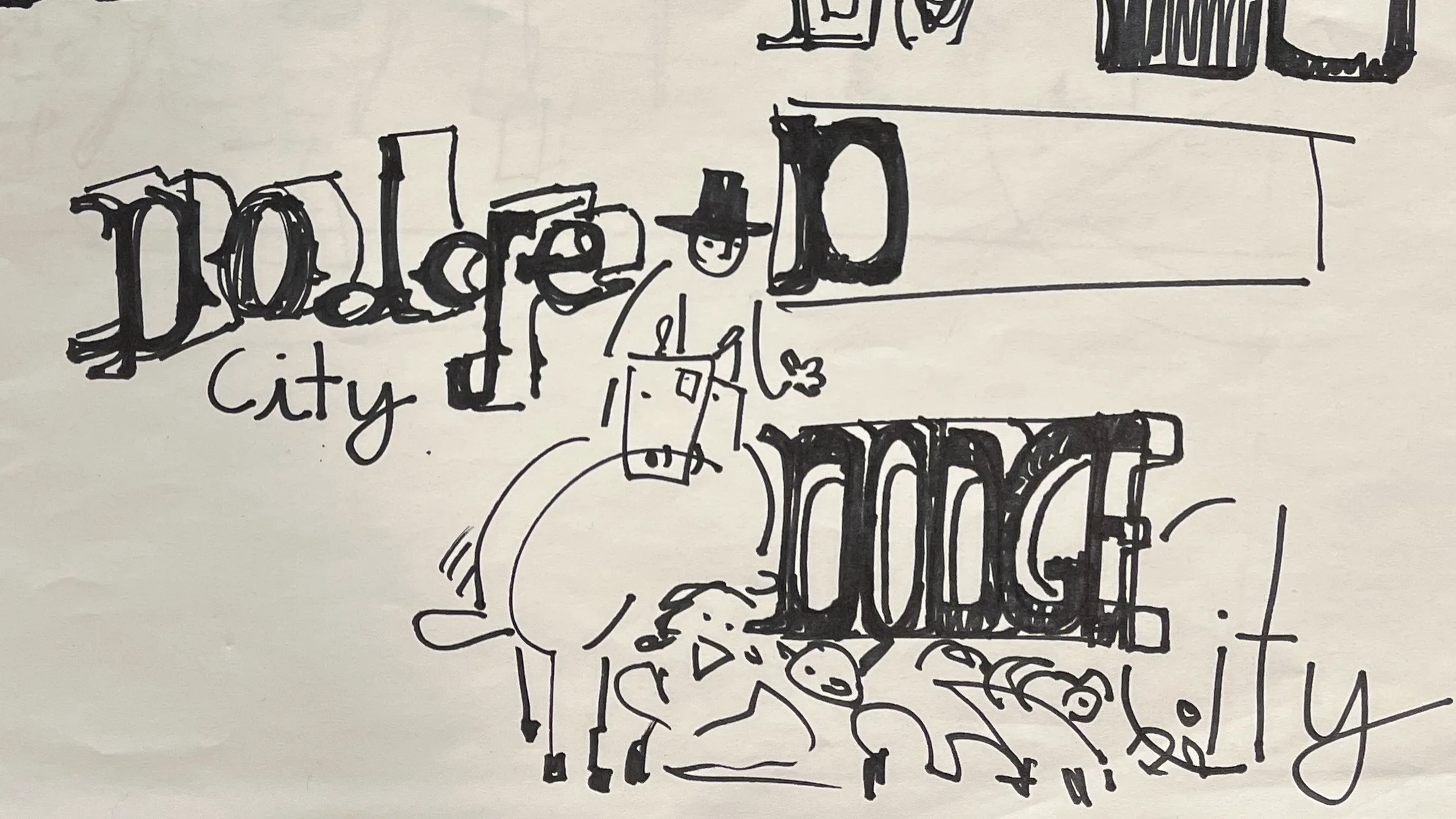
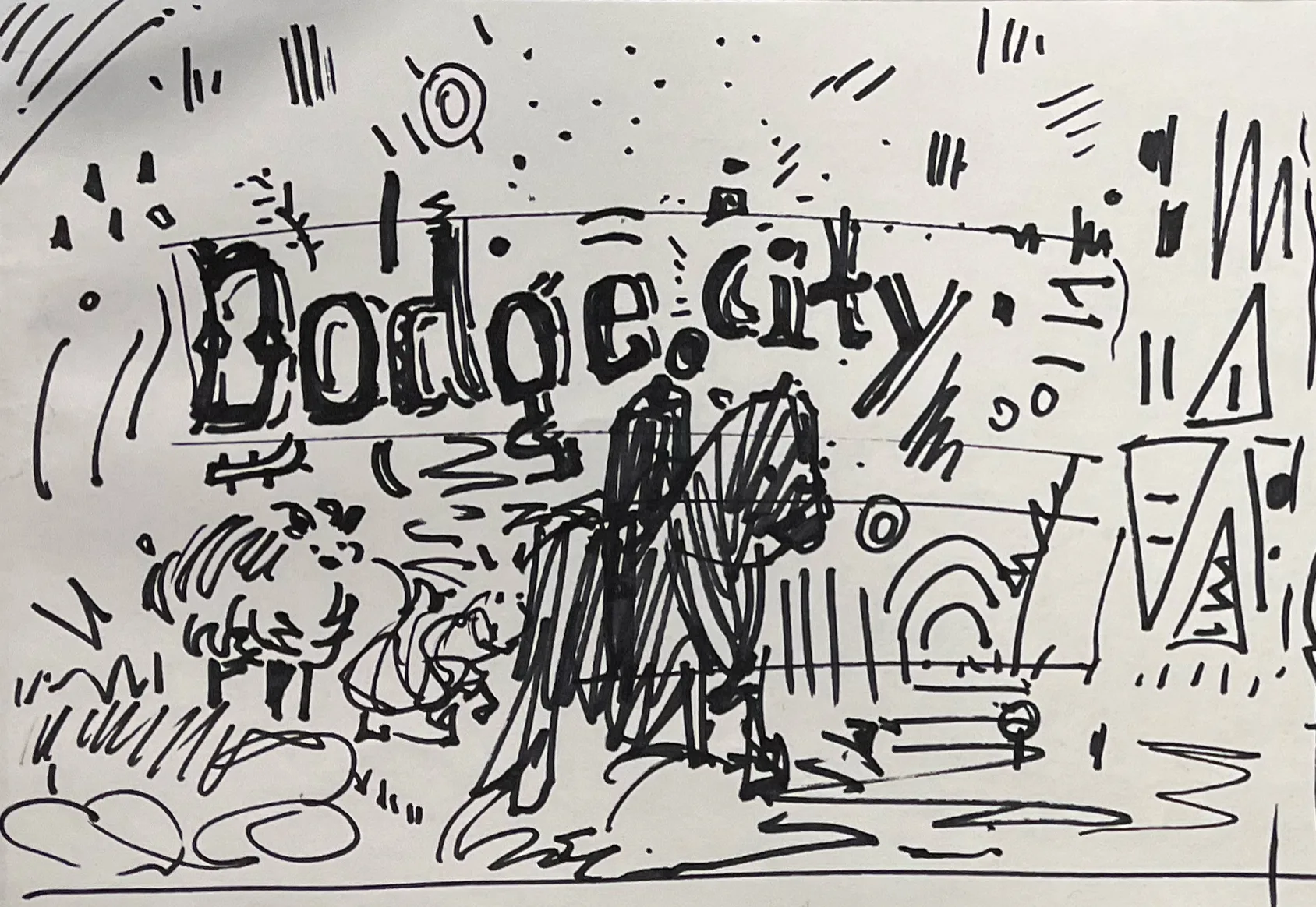
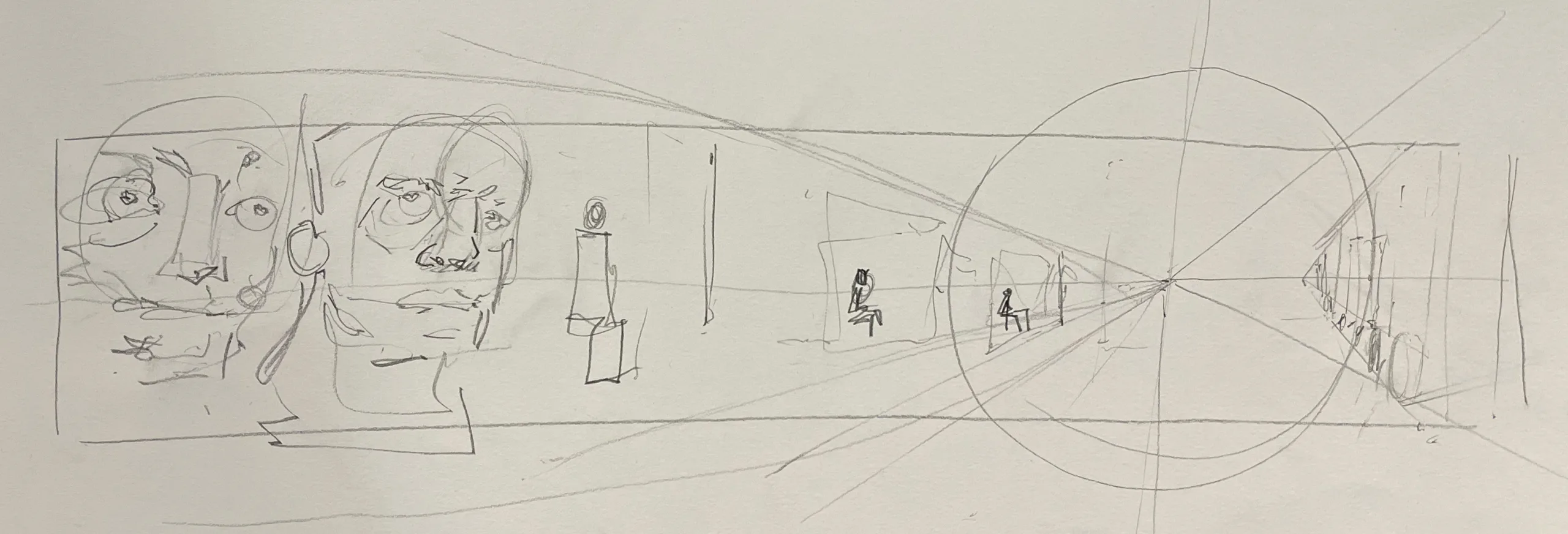
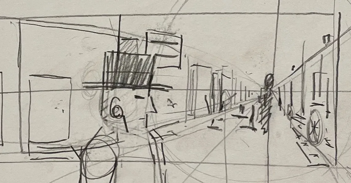
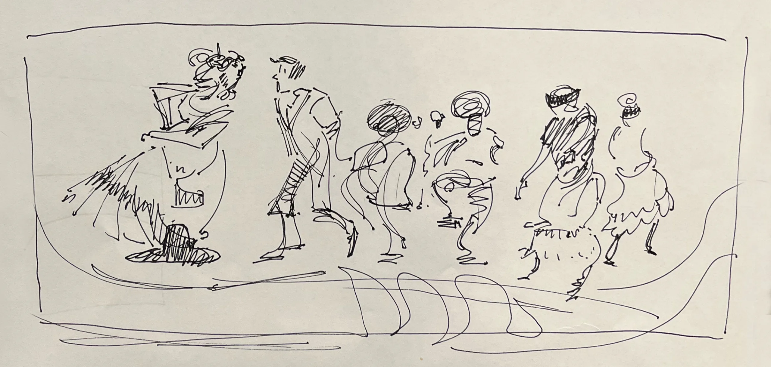
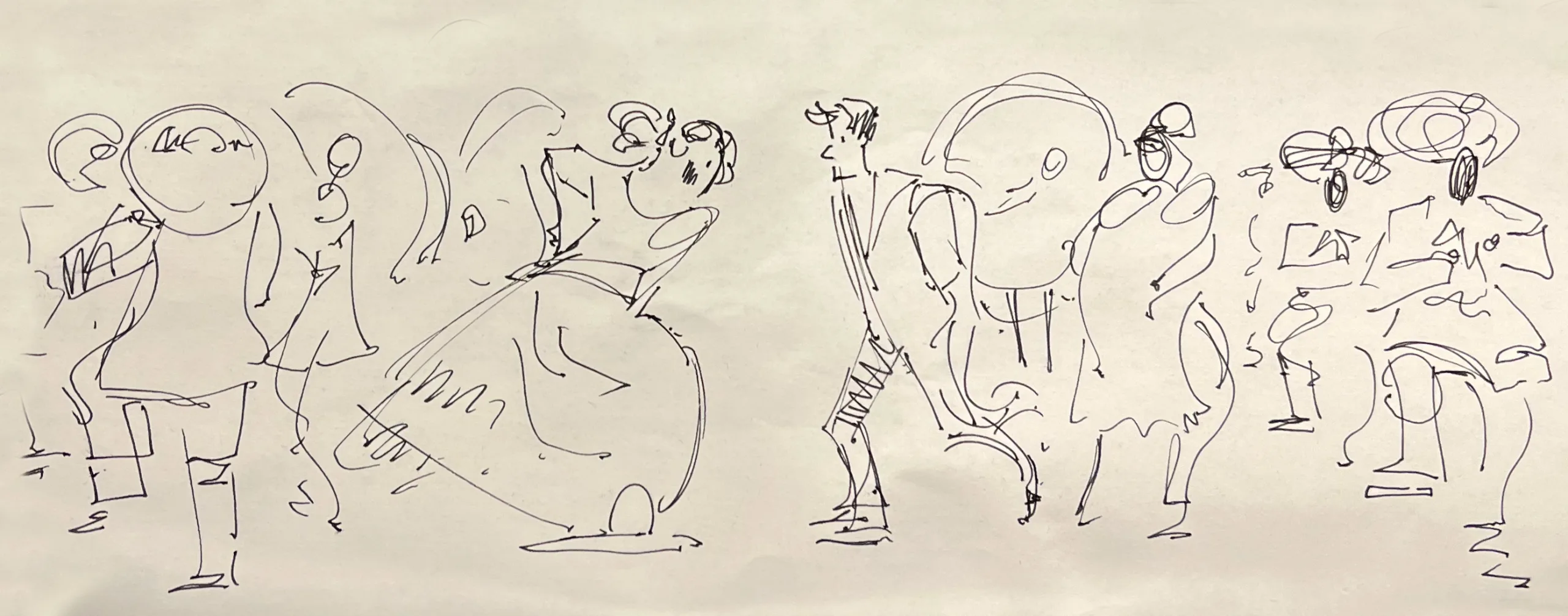
Every mural started as a drawing on a piece of paper. The cattle sketches explored how the name would sit above the herd, while the Front Street studies were mainly perspective work. For Fiesta, I worked through the dancers’ gestures to find a rhythm that worked across the wide composition.
Four Ways to Paint It
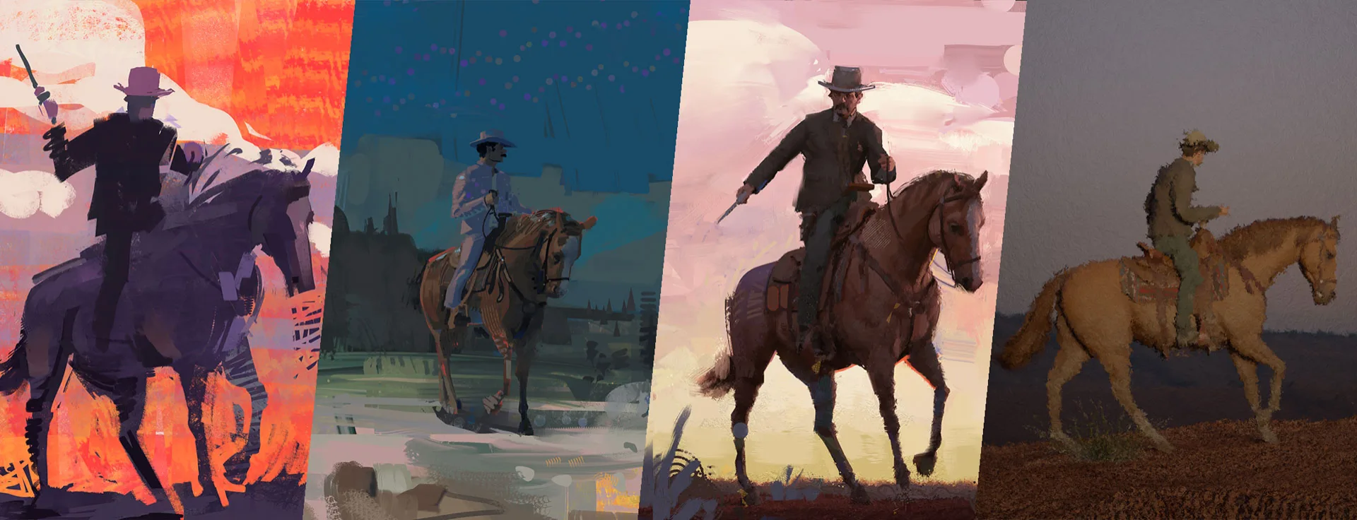
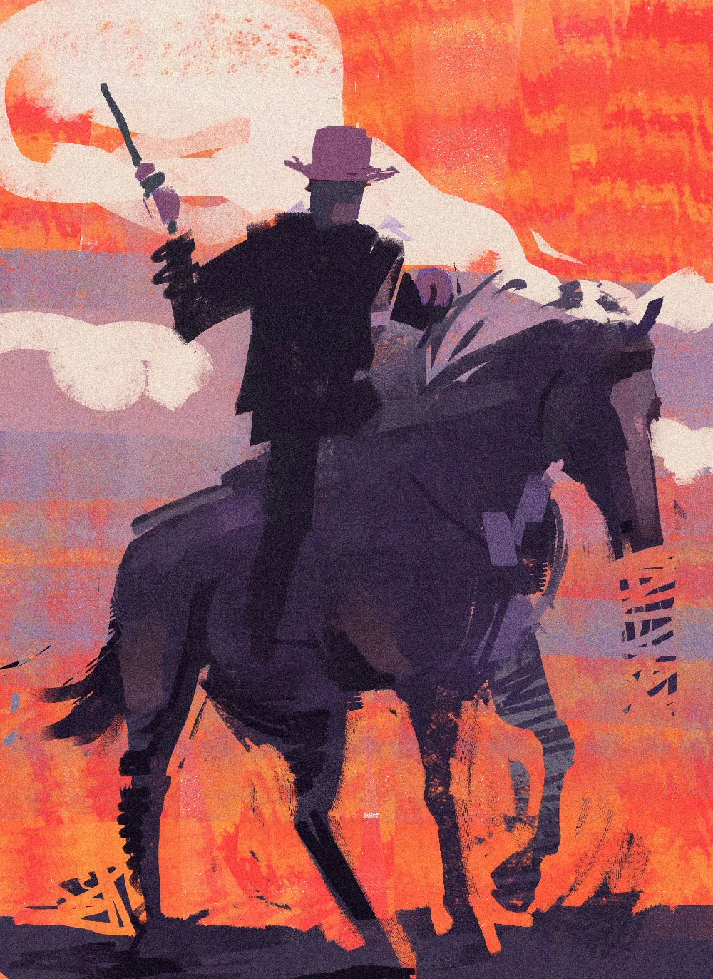
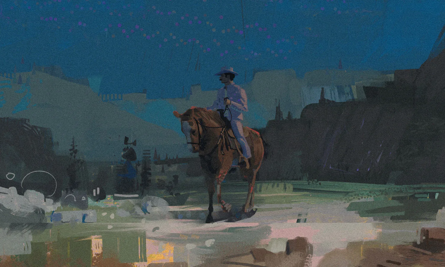
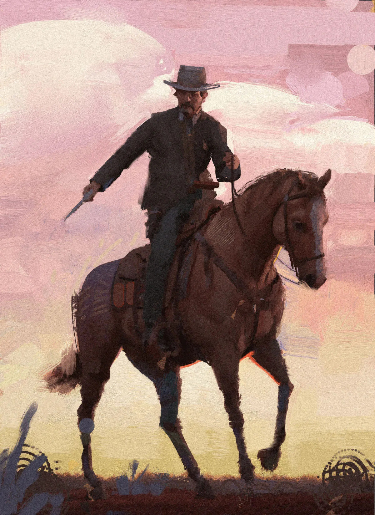
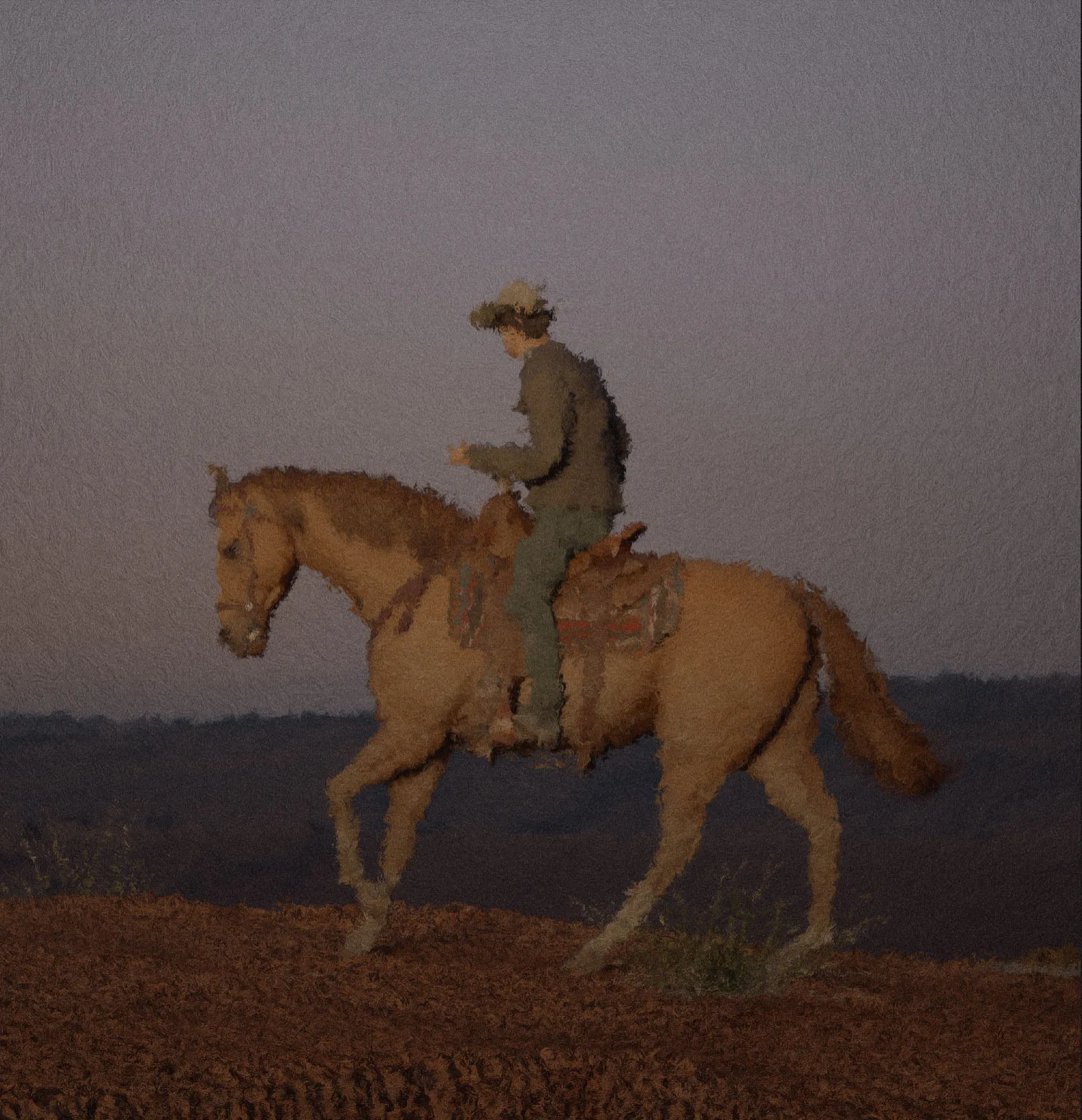
I painted four different studies of a lone rider to explore and settle on a visual direction. These ranged from flat graphic shapes to a near photographic finish, each with a different approach to color and atmosphere.
The painterly direction offered a perfect balance of expressive brushwork with enough clarity to hold together across a large wall. I was painting regularly at the time, which helped me develop the proposal quickly and in great detail. By the time I presented the concepts to the municipal team, the paintings were already giving them a clear sense of what the finished murals could look like. They approved the art direction straight away without requesting changes.
Bringing Lettering Into the Scene
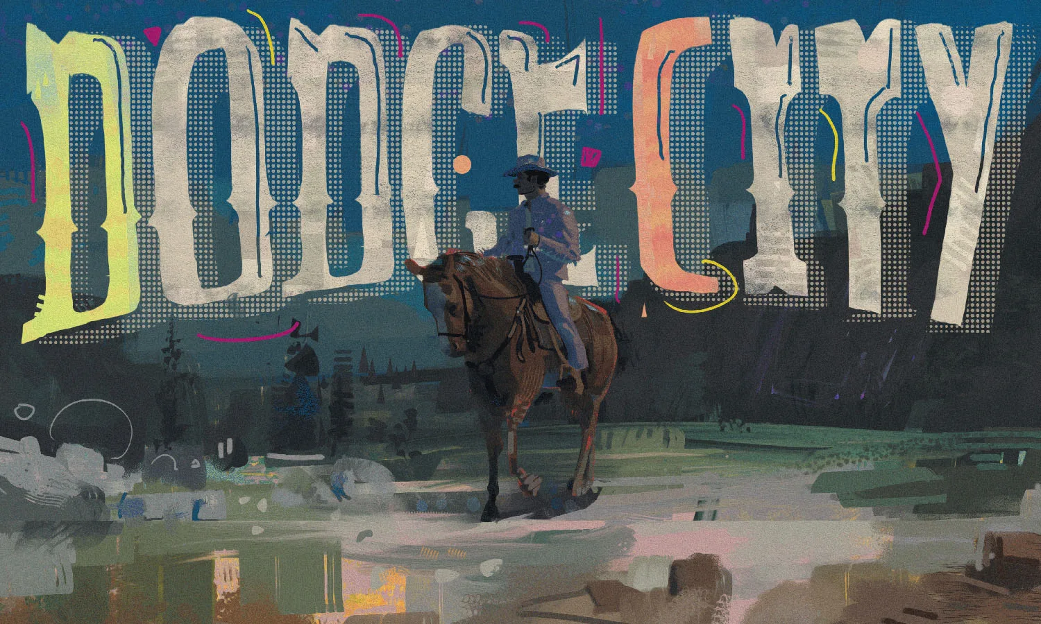
I tested a halftone, screen printed lettering treatment over the nocturne to see how a more graphic approach would work. It felt too different from the painting itself, so for the final mural I worked the lettering into the composition instead, using painted shading to connect the two.
Value Before Color
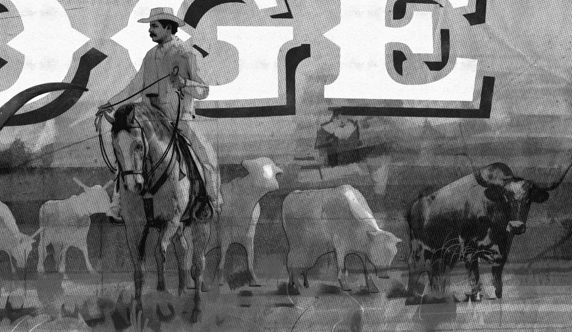
The cattle mural was resolved in grayscale at first, checking how clearly it would read at a distance relative to the mural scale. Establishing the contrast between the herd, rider and large lettering gave the composition a clear hierarchy of light before I even introduced color.
The Street, Built in 3D
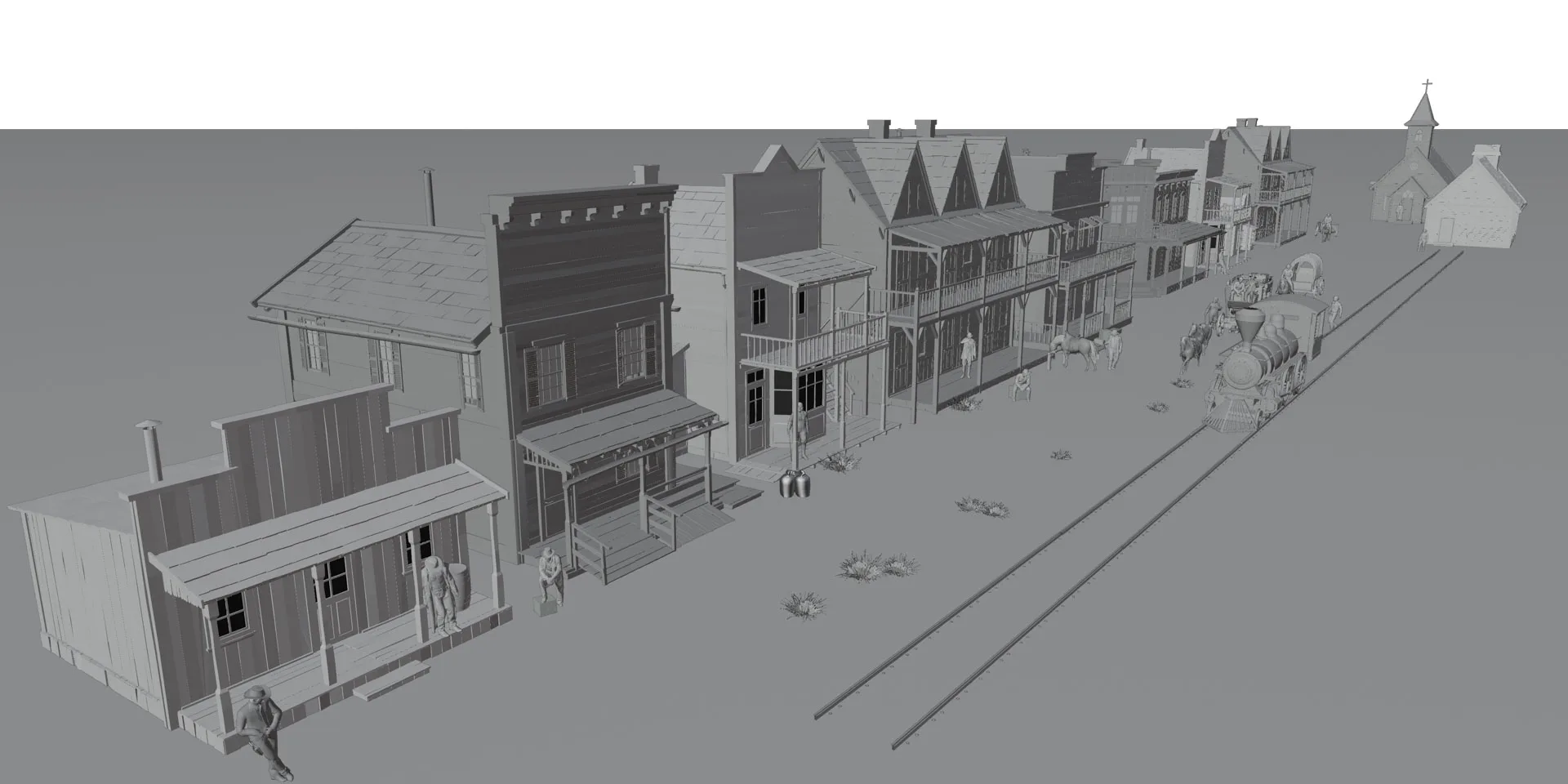
I built Front Street in 3D as I felt that the complexity of architecture was not conducive to a freehand approach. This enabled me to control the perspective across the full width of the mural, and freely adjusting the camera helped me arrive at the view I had explored in my sketches.
The gray render eventually became the underdrawing which I painted over, keeping the perspective consistent while giving the scene the same painterly finish as the other murals.

Installed
On the Wall
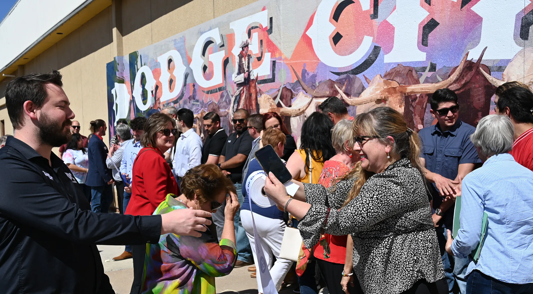
Historic preservation requirements ruled out painting directly onto the brick, so the finished digital artwork was printed and applied. This meant that every detail had to be resolved before production, so that the digital artwork would still hold up as intended after the significant shift in scale.