
As a map designer, I am less interested in how much detail a map contains than in how confidently it directs attention. If you’re wondering how to design a fantasy map, start with this idea: fantasy cartography should help shape the world from the outset, rather than simply illustrate a finished story. This guiding principle helps us create a map that becomes an integral part of its world, rather than a decorative addition.
Most fantasy maps are judged twice. Firstly, as illustrations: do they make us want to enter the world? Secondly, as tools: can we understand where we are and why a journey takes the shape that it does? The best fantasy maps pass both tests, simultaneously creating desire and delivering information. A beautiful coastline can certainly establish mood, but a functional map also needs clear visual hierarchy and contrast.
What Makes a Good Fantasy World Map?
Fantasy world maps deserve to be discussed as a form of information design as well as illustration. A mountain range can establish the atmosphere of a region, but it can also explain why a settlement is isolated or why an army must approach through a particular pass. The most convincing geography contributes to the story before a character ever journeys through it.
Among the many remarkable fantasy book maps, Middle-earth and Westeros stand out as two defining works. Their visual approaches differ considerably, but both show how a map can direct our attention while also leaving enough space for imagination. These ideas also extend to video game maps, as we’ll see later with Hogwarts Legacy.
Middle-earth: Mapping Myth and Movement
Few fantasy maps are as instantly recognizable as the map of Tolkien’s Middle-earth. The Misty Mountains divide the landscape and force its travelers to cautiously consider where they can cross, while the Anduin gives the eastern lands a clear north-south spine. Beyond Frodo’s own journey, the Gap of Rohan creates a strategic opening between several mountain ranges. Its location clearly positions it as a key crossing, using visual language to clearly show that whoever controls the Gap controls movement between continents.
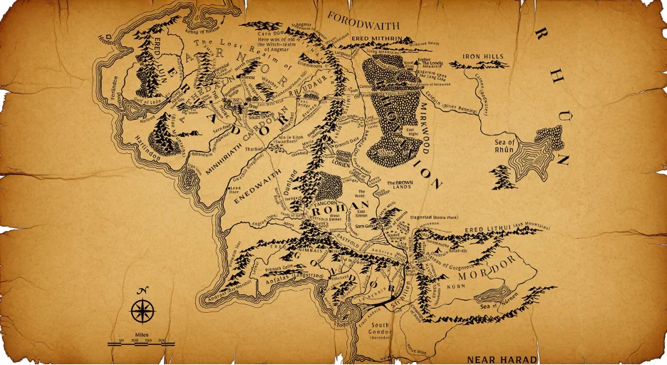
Visually, the map feels ancient and hand-drawn while also serving as a disciplined piece of information design. Large, widely spaced labels identify realms such as Rohan and Gondor, while smaller lettering is used for settlements and minor features. This functional hierarchy lets readers understand the larger geography before examining a particular route.
Although there is no boxed map legend, repetition and context make the symbols easy to interpret. Mountains and forests have distinct forms which retain their meaning wherever they appear. Similarly, the compass and mileage scale provide logical orientation without competing with the landscape, allowing readers to explore the map without constantly relearning its visual language.
As a map designer, what I find most compelling is that the geography never feels passive. When I trace Frodo’s path from the Shire towards Mordor, I can see the barriers that shape his decisions and the detours they impose upon him. Tolkien’s creative process makes that relationship explicit. As he put it, “I wisely started with a map, and made the story fit.” For me, this is what makes a great map so valuable: it can not only help an author discover the journey, but also assist the reader in following it.
Westeros: Mapping Climate and Power
If the map of Middle-earth helps us follow a journey, the Known World map from The Lands of Ice and Fire helps us understand power. It uses more color and illustrated relief to make environmental pressures visible at a glance. Frozen whites define the far North, while the warmer orange of Dorne implies its heat and aridity. In between them, greener regions imply better conditions for settlement as well as the resource abundance that sustains it.
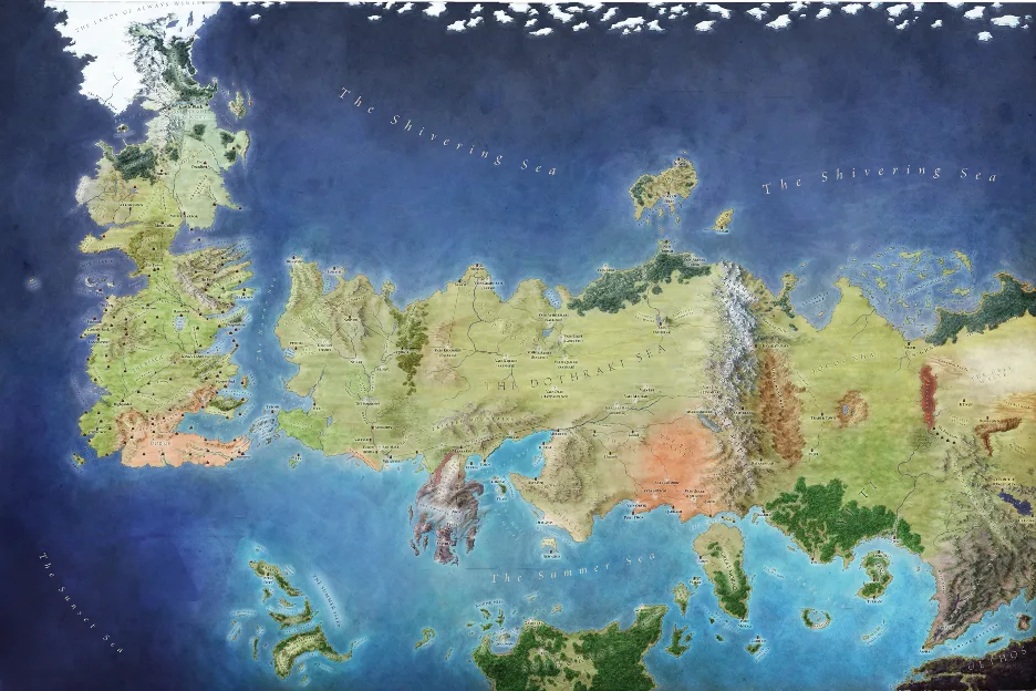
The terrain furthers this visual storytelling. The Neck restricts movement between the north and south, while the Mountains of the Moon protect the Vale. The map’s geography makes territorial control meaningful because it clearly determines which places are exposed and which are difficult to reach.
Importantly, the Westeros map has no visible scale bar, preferring to instead communicate relative position. This purposefully doesn’t invite precise measurement and effectively directs attention towards neighboring regions and strategically important crossings. The wider map framing also places Westeros within a world that extends well beyond the locations most familiar to readers.
What I particularly like is that this map has a compelling story and point of view. George R. R. Martin has explained that the Known World represents the lands and seas a maester at the Citadel might know. It is deliberately incomplete; at its distant eastern limits, knowledge gives way to uncertainty and eventually legend. For me, those limits make the map more convincing, because it feels like an artifact from within the fictional world itself, rather than a simple guide for readers.
These examples show why the best fantasy maps are selective. Middle-earth makes the constraints of a journey tangible, while the Known World of Westeros gives geography a political perspective. Neither needs to explain everything. Each provides the information that makes its particular world easier to understand.
Tactical Cartography: How to Design a D&D Map
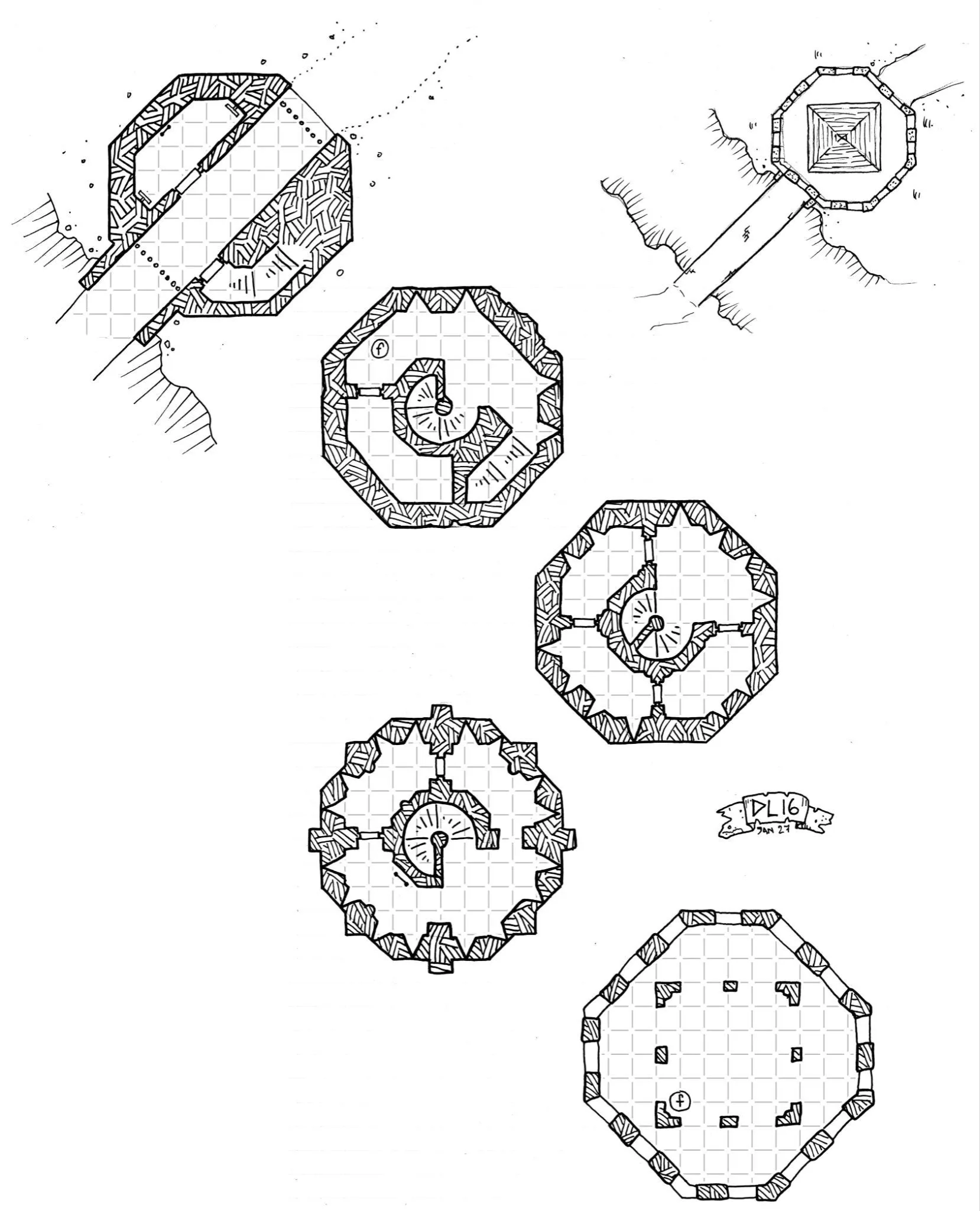
In most fantasy book maps like Middle-earth and Westeros, geography helps readers understand a story that has already been written. However, Dungeons & Dragons redefines the genre by asking the map to support a story as it unfolds. Players decide where to go, and their choices change what happens next. A DnD map therefore becomes part of the game itself, giving the group a shared understanding of the space in which those decisions take place.
Interestingly, not every campaign needs a fully illustrated continent. A world map can begin around the characters’ starting point, leaving deliberate blank spaces for the Dungeon Master to fill with lore as their adventure develops. For me, this selectivity provides enough structure for exploration without defining every possibility in advance.
Battlemaps operate at a much closer scale. Here, a player needs to understand whether a doorway is within reach, or whether a wall blocks the view of an opponent. When the group uses a square grid, the official D&D rules assign five feet to each square. The grids need to align with the terrain, and while they are optional, a consistent understanding of distance is essential to making the map useful during play.
3D Cartography and UI: The Hogwarts Legacy Map
Fantasy maps also play an important role in video games, where they guide players through worlds they can explore directly. My favorite example here is Hogwarts Legacy, whose castle presents a particularly interesting challenge for map design. Its towers connect through passages at different heights, so a destination that appears close from above may require a long journey through another wing.
The game’s rotatable 3D castle map is a masterclass in 3D spatial visualization. It gives the building a recognizable form and instead of presenting every corridor at once, it divides Hogwarts into areas with regional flags. This creates an initial level of hierarchy, allowing players to choose an area before examining its destinations.
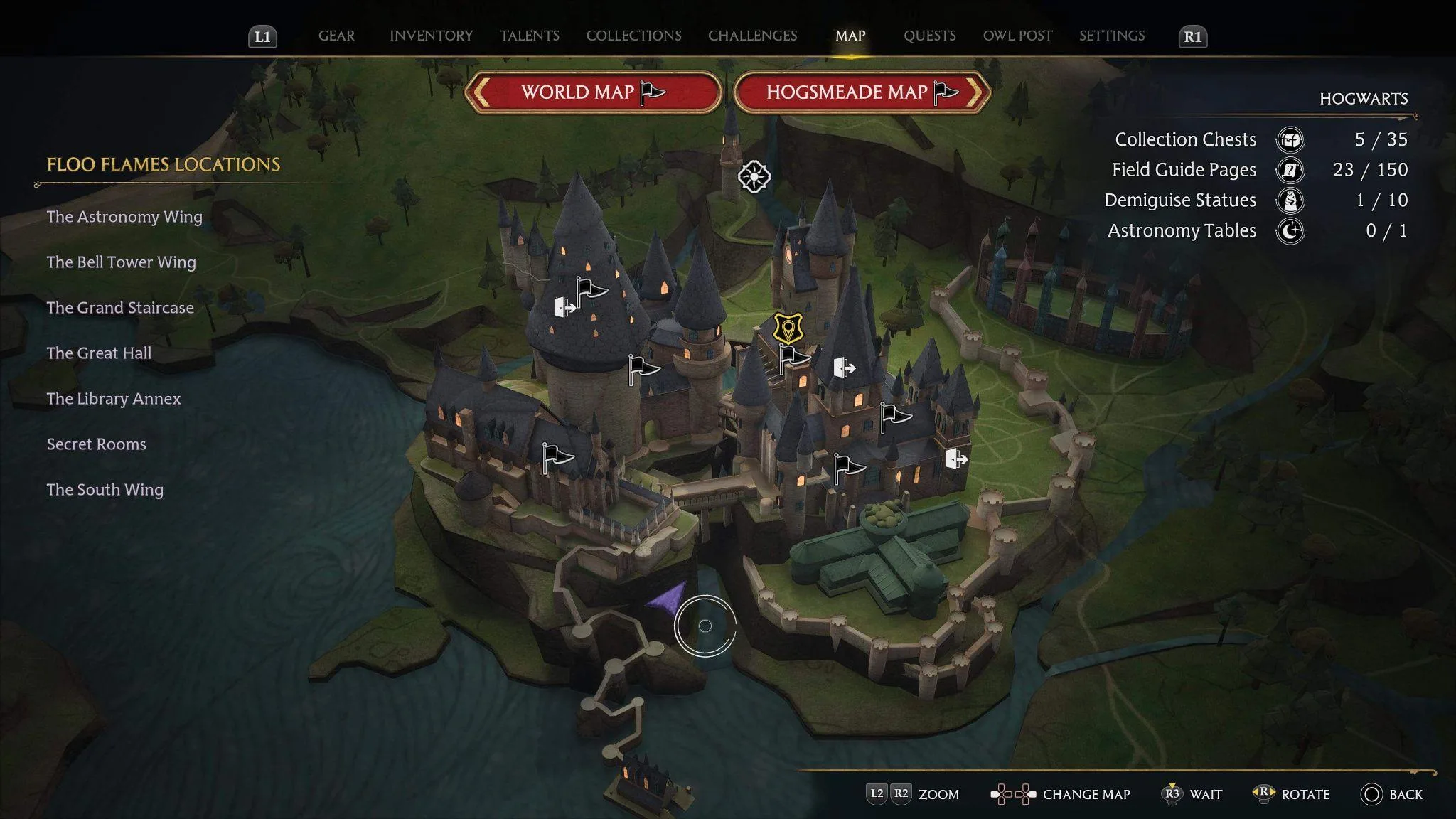
The interface reveals information as locations are selected, including Floo Flame fast-travel points and regional collection counters. I believe its value lies in connecting the castle’s 3D overview with tracked destinations and the minimap, helping players decide where to go next.
As a map designer for real-world venue maps, I think video games provide a window into an exciting future where real maps can also be interactive, and exploring the map itself becomes part of the experience.
Real-World Fantasy Maps: Designing for BookCon
I had the opportunity to explore that relationship in my work for BookCon at the Javits Center. I had previously designed a multi-level isometric New York Comic Con map. BookCon offered the opportunity to take that administrative foundation somewhere more imaginative. I wanted to design a fantasy event map that could make exploring the venue feel like an extension of the fictional worlds visitors had come to celebrate.
I used illustration to turn a floor plan into an invitation to explore. I applied a vertical composition to make movement through the venue’s five levels feel like a journey, and developed a fantasy visual language that included ships and dragons. For the map legend, I settled on a scroll theme that explained the symbols for facilities and maintained practical necessities like booth and room numbers in the drawing. The end result was a map that combined my imaginative treatment alongside practical information seamlessly.
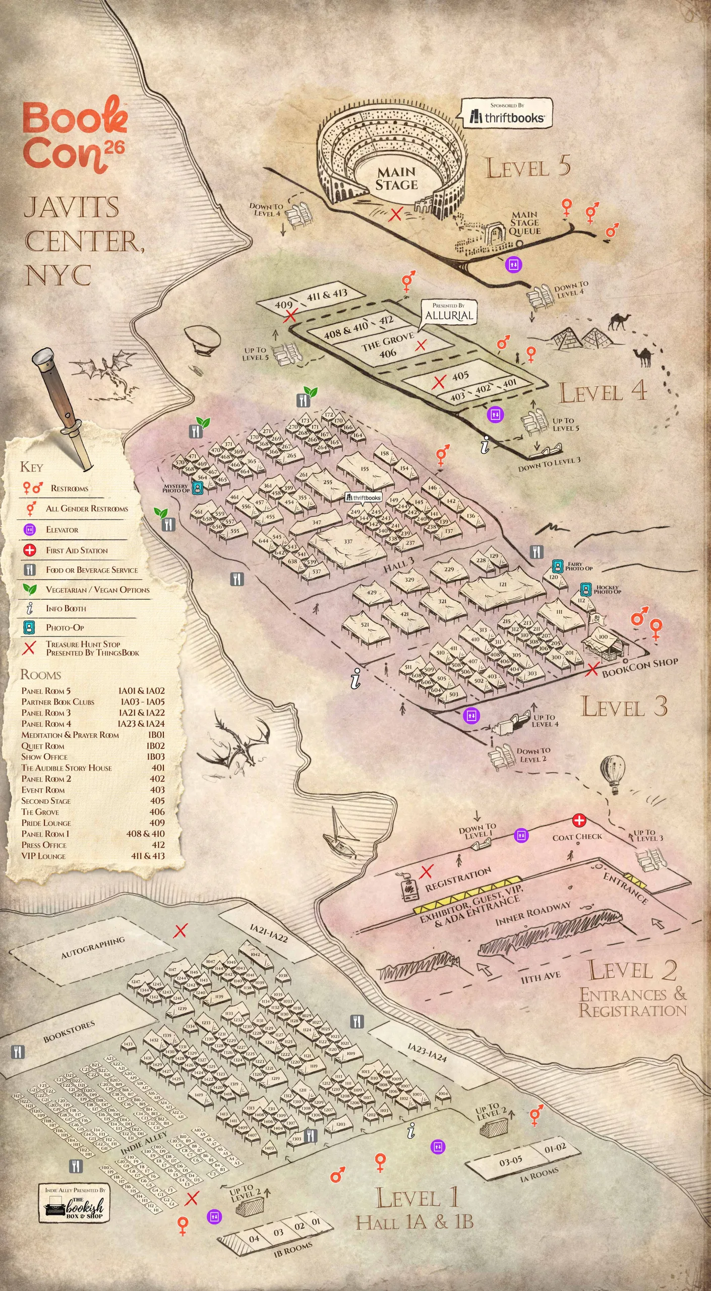
The map’s visual richness was part of its appeal, though it also created a few practical wayfinding challenges. In retrospect, the illustrated map was engaging but insufficient as the only wayfinding tool. Some artwork competed with labels, and some unfamiliar symbols were not immediately clear to visitors. At mobile size, the density could also make certain routes harder to follow. To address this, we also created a simpler 3D view that gave greater priority to the levels and key destinations.
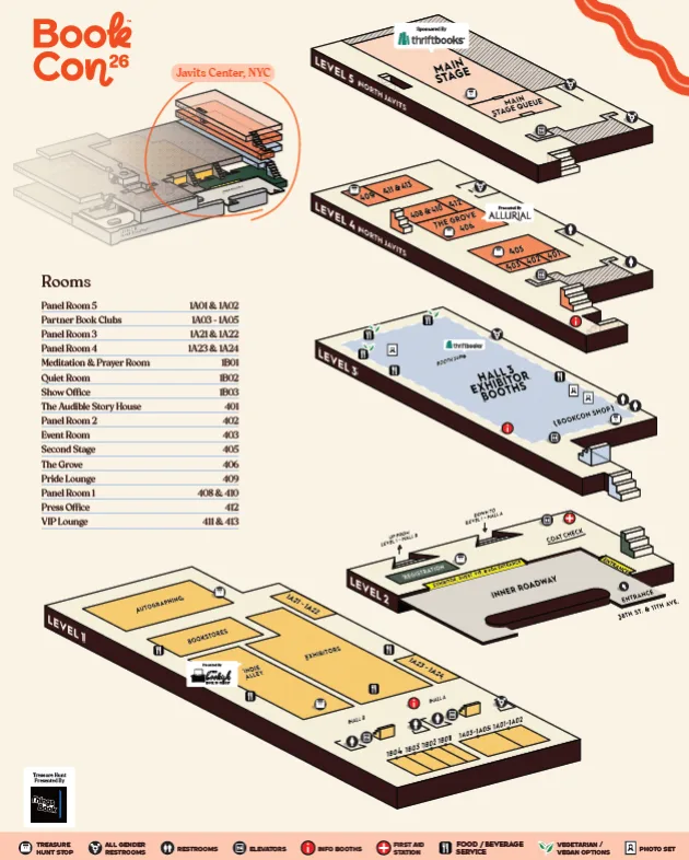
That experience reinforced something I now consider central to map design: accessibility belongs in the decisions about what to show and how clearly to show it. The narrative beauty of a map should always support the visitor’s experience without obscuring the information they need.
How to Draw a Map (Software, Workflow & AI)
The examples above approach functionality in different ways, but they begin with the same decision: what is the map’s job? If you’re trying to understand how to draw a map, I suggest starting with that question. Choosing the right software is also important, but that choice should always come after we establish the map’s purpose.
The Workflow Before the Software
Before opening a map editor, I recommend writing a navigation brief. Identify who will use the map, what they need to find and the format the map will be viewed in (consider mobile vs. desktop).
Using this brief, aim to establish outlines and movement barriers first, including actual floor connections in venues. With the structure in place, you can then set the label hierarchy and develop consistent pictograms. I also strongly believe that the map legend should be created at this stage, as symbols take shape, so that it can inform the design early on.
There are tools which can assist with the map making process, such as Inkarnate. However, while these tools certainly have their uses, custom layered workflows in vector and image software offer greater control over accessible typography and branding. Whichever workflow you choose, always test the map at its intended size to ensure the final product delivers as intended.
Can AI Create Fantasy Maps?
Yes, AI can create fantasy maps, and its usefulness extends beyond isolated decorative assets. ChatGPT can generate a draft map from a description, while image tools such as Midjourney can help explore antique parchment textures or illustrated mountain styles. These tools can be useful starting points when deciding how a world should feel, but they do not remove the need for a designer to decide how that world works. The information architecture still needs a human eye which can discern which locations deserve emphasis and how their relationships should be explained.
For instance, an AI system can definitely suggest a trade route between two cities, but that route may not make economic sense depending on the resources each city has. The need for human involvement becomes even more important in real-world wayfinding. For instance, directions to an accessible elevator must match a verified floor plan, and AI-generated artwork cannot establish those facts by appearance alone.1
For me, the useful role of AI is to assist exploration and production, where that means assisting with 3D workflows or helping us learn new software. I recommend using it in this way rather than simply generating an image, which can be difficult to revise without separate layers. The map designer should always retain responsibility for the narrative decisions and the accuracy of the information that people will actually act on.
Sources
- OpenAI, “Image Generation: Limitations,” OpenAI API documentation, accessed October 3, 2026.1
- “Map of Middle Earth Wallpaper,” Wallpapers.com, accessed October 3, 2026.
- George R. R. Martin, The Lands of Ice and Fire, maps by Jonathan Roberts (New York: Bantam Books, 2012).
- Dyson Logos, “The Bridge Tower,” Dyson’s Dodecahedron, February 9, 2016. Licensed under CC BY 4.0.
- Avalanche Software, Hogwarts Legacy (Warner Bros. Games, 2023).